Inspiration

In this blog post I want to show you some of the posters I took inspiration from as part of my research for the typographic walk poster. Ill explore how what works, doesn’t work, and things I think I could maybe use in my designs.

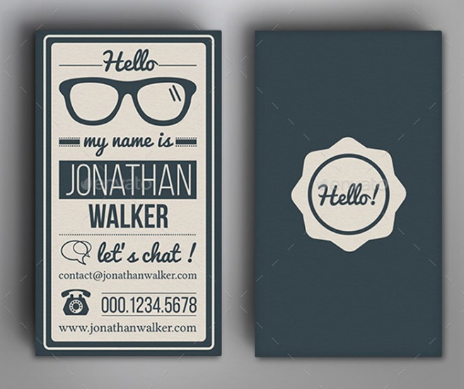
Ill start with this piece. I really like how there is lots of different typefaces used within one poster that all compliment each other. They different combinations are used to group text. This can be seen with the two hand written fonts used in “hello my name is”. The contrast in font weights between “Jonathan” and “Walker” works well, the larger point size of Jonathan compared to the smaller point size of Walker almost works as opposites, which might work well in my design. I also like the framed outline, with a cream coloured space in the middle where all the text is clipped in to the background. This is a strong idea and I would like to hopefully use this technique of layering in illustrator. 152
I really like the typeface used in this design. Its Bebas, a bold sans serif font which looks, in my opinion, very eye catching. In this design all the text is left aligned, which I don’t think will work for my design, and I also just want the title “Typographic Walk” in bold, so people can differentiate between the important text and the lesser. The minimalist look is really nice, however, I have quite a lot of text to put into my poster, and I think the use of one point size and typeface may detract from the important text. Also, I noticed how the gaps between all the edges are equal, and this makes the text look even bolder. Bebas-Neue-Typeface-Poster-Design-by-Moe-Pike-Soe-46573

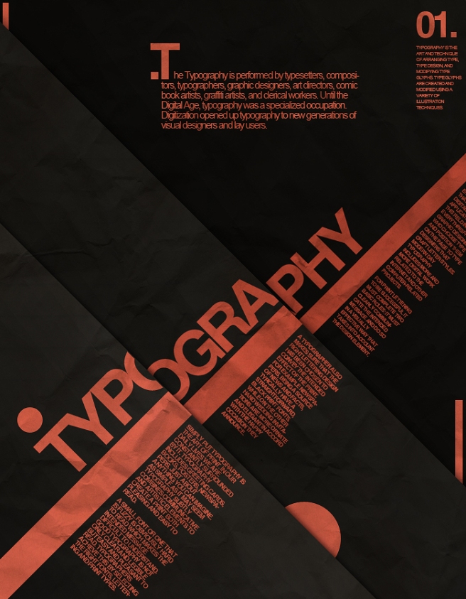
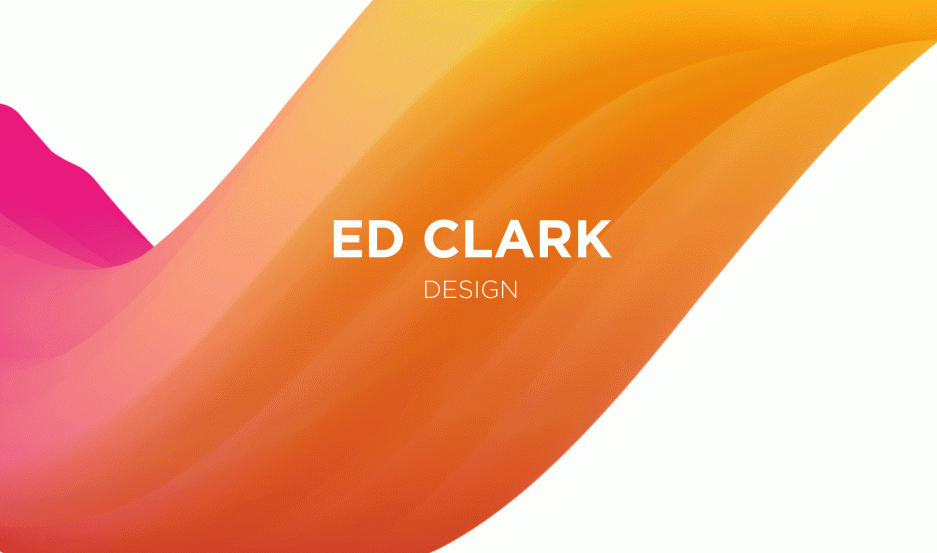
This design is really eye catching is lots of different ways. I particularly like the 3 dimensional feature spread across the portrait piece. Its clear they have used a grid to align the text, which is quite effective against the 3d boxes. I think however the type is quite boring, and might not inspire my audience to attend the event.

typography_by_alesfuck-d2ydg1w

Evaluation of Typographic Poster Project

The typographic poster project was initially daunting, in the sense that we had to come up with our own creative ideas and use industry standard software to produce a professional piece of design. However, after working through the design process methodically, the creative ideas started to flow and I was able to write down everything I thought of, and then sketch out the ideas I thought were suitable and achievable. This actually aided me in the layout of the text and imagery.

When gathering images of examples of type, I took pictures too far away, and not isolating individual characters that I may be able to use in the design. If I were to do this again in the future, I would study the brief more closely before going off to do research, and maybe use more sketches to have a clear image to work to.

Having empathy towards the intended audience was something I struggled with in the beginning. Actually understanding who the poster would be targeting and what they’d expect to see was difficult, however after researching other typographic posters I was able to pick out key elements that would make my poster appeal to the intended audience. For example, I picked out certain fonts I wanted to use, the contrasting type for different elements of the text to make more important text stand out, and the less important less prominent, and the layout, spacing, kerning, and tracking of the type.

When it came to actually digitally designing my poster, I found it difficult to stick to one design I really liked and follow through, developing ideas. By the end of the project, I felt confident in my selection of images and type, and believe my poster will reach the intended audience, and meet the brief. Sometimes I would dwell too long on a design feature that was over complicated for this specific project, and then felt rushed to get ideas that would work well. This comes down to time management. Looking at what time scale I have to complete the design process, breaking the process up into smaller, bite sized sections, e.g. research, sketches, ideas, imagery, typography, and layout, and dividing the time up equally. This way, I will feel more organised, and less frantic, making my designs more structured and hopefully, overall a better end product.
Throughout this process, I’ve noticed the importance of gathering as many ideas as possible, no matter how crazy or abstract they may be. A lot of the time, I’d think of one idea and then develop more ideas around that same topic. So even though the original idea may be inconceivable, the ideas that follow may have some substance and be able to use them in the design.

I also found blogging difficult at first. In the future I will blog as I progress through the project, and not leaving it until the last minute. It works better as a diary and writing an evaluation after I’ve learnt or noticed something, so I can remember for next time.

I really enjoyed looking at the different forms of type in one specific place. It was interesting to look at what the messages the different typefaces convey, and how they can be combined to with imagery, illustrations, and shapes to create a really effective and eye-catching poster.

Evaluating my designs and other peoples work was also incredibly useful. Referring back to Edward De Bono’s idea of PMI, I was able to pick out elements of the designs that I liked and thought worked well, and what may be interesting to use in my design or later designs further down the track. Also evaluating what didn’t work so well was important, so I didn’t replicate these in my own designs, hopefully achieving

Playing with Kerning

I used a really good tool today in my bid to improve my knowledge of kerning. I went onto a website called http://type.method.ac/. It was helpful to see what bad kerning can do to the appearance of a typeface. This is particularly important when thinking about my typographic poster. The intended audience are professional typographers and typographic enthusiasts, and they will no doubt notice if individual characters aren’t spaced properly within a word. It just looks wrong. The readability of the words is very important make the design look correct and maximise the impact.

Screen Shot 2015-10-18 at 15.53.43

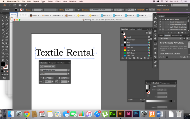
The image below shows an example of bad kerning. You can clearly see that the “T” and the “e” aren’t spaced in accordance to the rest of the word, making the readability more difficult. Also the spacing between the “n” and “t” in rental also looks wrong.Screen Shot 2015-10-18 at 16.11.33

To rectify the problem, I simply go to the character palate, and manually adjust the kerning until the spacing between the characters is equal, making it easier to scan and read quickly.

Screen Shot 2015-10-18 at 16.19.47

Process of design

In this post I want to show the evidence of the process I went through when implementing my designs into digital format.

Design 1

Type_walk_poster

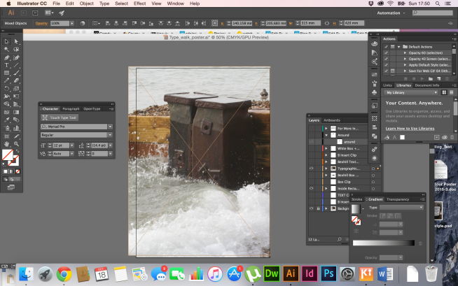
I initially placed the desired image I wanted to use as my background.

Screen Shot 2015-10-18 at 17.50.26

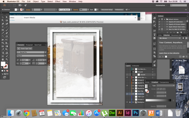
I then made a border and a box aligned centre, coloured white

Screen Shot 2015-10-18 at 20.08.03

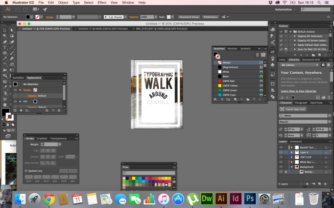
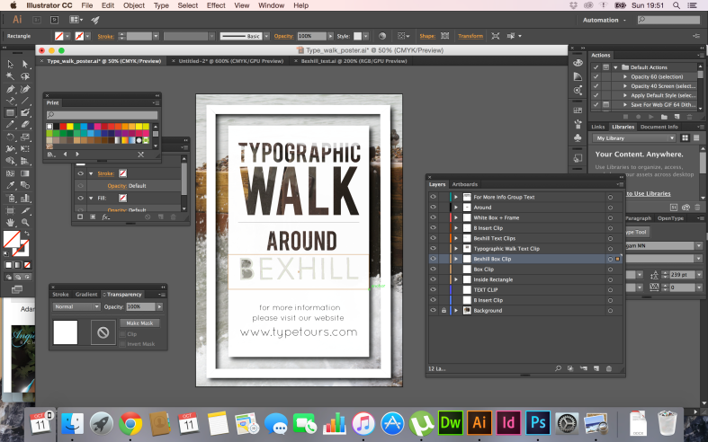
I worked on different layers so everything I did could be edited easily.

Screen Shot 2015-10-11 at 17.06.48

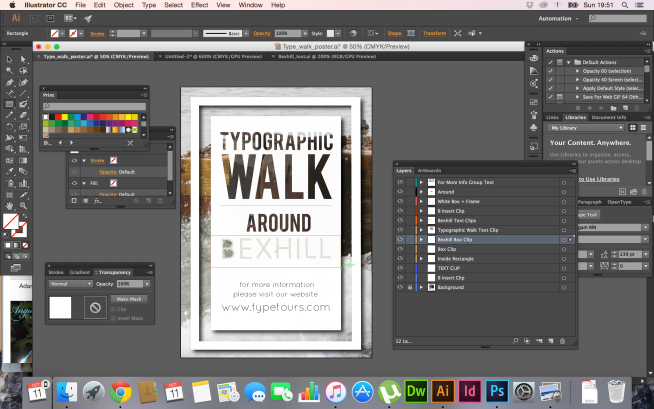
I cut around the type I wanted to use in the design with the pen tool in illustrator, then went to object, clipping mask, make. I did this for every individual character, on different layers. I placed this text above the the background image so it was visible above the background. I also created a rectangle, made it a compound path, and then clipped it to the background. This made created a good contrast between the darker background and the white text.

Screen Shot 2015-10-11 at 19.51.44

I also clipped the inside of the B so you could see the background more. I also clipped a box and placed it behind the Bexhill text layer, and clipped it to a copy of the background image. I thought the darker colours of the image contrasted well with the white text, and also it reveals more of the background image.

Screen Shot 2015-10-11 at 19.01.10

Screen Shot 2015-10-11 at 16.13.07

I played around with the arrangement of the “around” segment. I thought it would work well to visually show how the text fits around another piece of text, meaning people don’t have to read the text, they get an idea from the imagery. In this design, i  don’t think it actually works. I like how its all straight lines and aligned centre, and having an ellipse in the middle makes it hard to position the other text around it to work well.

I then inserted the website text at the bottom.Screen Shot 2015-10-18 at 20.13.45

Design 2

poster_05

I first placed my background image onto the art board

Screen Shot 2015-10-18 at 20.20.43

I then cut out the T I would use for in the title, “Typographic Walk” in illustrator, and then made a clipping mask so only the T was visible.

Screen Shot 2015-10-18 at 20.28.00

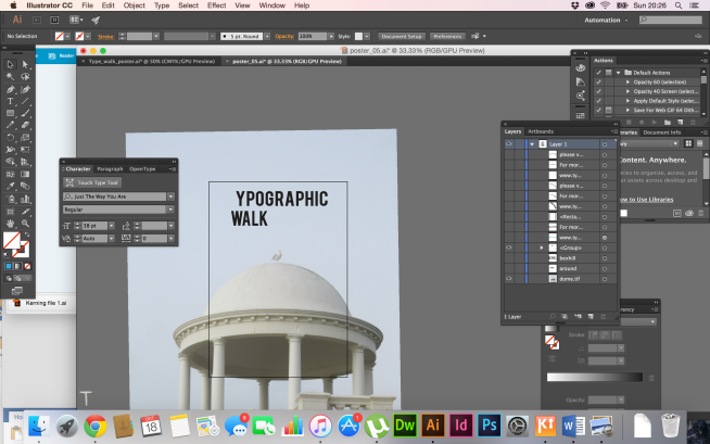
I chose which typeface I wanted to use alongside the T. I used Bebas as I wanted to use something that was bold and eye catching. I felt like it worked well with the other fonts in the design.

Screen Shot 2015-10-18 at 20.26.26

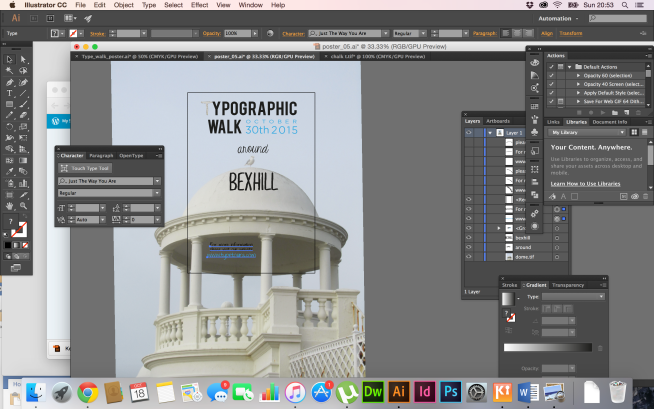
I then decided to arrange the “around” text on an ellipse, above the seagull. I used a font called KG Eyes Wide Open, a handwritten font. I feel like this gives a touch of elegance and class to the design. I then chose the type for the “Bexhill” text. I used a stylised font called MARI&DAVIDRegular. The font has a texture that works well against the white stone behind. I also like how its sans serif, and quite long height, it sort of mimics the properties of stone and the structure of the dome
Screen Shot 2015-10-18 at 20.41.44

I positioned the website text below the dome, bottom left of the design. I felt like the less important text had to be read, but the smaller point size doesn’t draw the audiences eye to that part of the design, and more to the sky and dome where I want to direct there eye. I chose the font “Just The Way You Are”. I like how its quite rigid for a sans serif typeface, and looks to be hand written in a amaturish style.Screen Shot 2015-10-18 at 20.53.55

Sketches & Ideas

After our trip to Bexhill, I thought it would be a good idea to get some sketches down on paper so I could visually construct my design. After initially doing my 100 ideas, I chose what Ideas were sensible and realistic. I took the time to just get a load of doodles down. I did this so I could see dimensions and arrange the layout in accordance to the hierarchy of importance of the text, and the layout of the imagery if any.

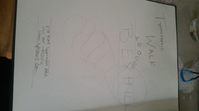
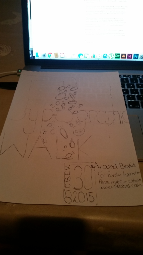
I came up with the idea of pebbles bouncing off the different letters in the design, and thought it would link well to Bexhill being a seaside town. I drew experience from the Illustrator awards at Somerset House in London, where movement could be illustrated and implied by simple lines

I also came up with the idea of fitting the text within a bird. I did this because it links in well with the seaside theme. I would have liked to have developed the idea however, I felt like my capabilities in illustrator wouldn’t allow me to. I hope to in the future learn how to do this and use effectively in a design.

20151016_155554

I wanted to link something with the idea of moving or walking. The first thing that came to mind were footsteps or footprints. I wanted to incorporate this into a design. I found it difficult to arrange the footprint effectively in a way that would be visually stimulating. I tried blowing it up to a fill the page, and maybe when it gets to the computer design, lowering the opacity so it fades into the background. I also had the idea of fitting it below or around the word “walk”, however I thought it looked a bit like clip art and quite amateurish.

20151016_155909

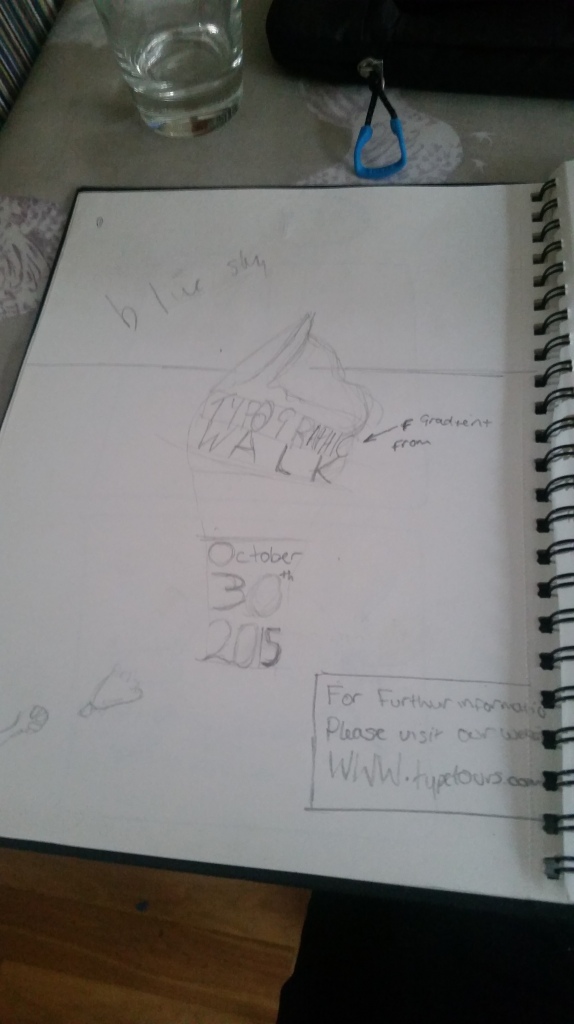
Ice Cream Design
Ice Cream Design

I quite like this design, and i think i would be able to achieve this when it comes to implementing it into a digital design. I’d like to fun bold colours like blue and pink and maybe use a drawn sans serif typeface.

20151016_155748
Army Memorial Design

20151016_155727

I like the idea of using the around on a curve, I think this could be quite visually pleasing, however I may want to use a smaller point size and maybe all in lowercase as its less important text, and I don’t want to detract from the more important text. I also like the alignment  of the body of the text, centred and should draw the audiences eye.

20151016_155828
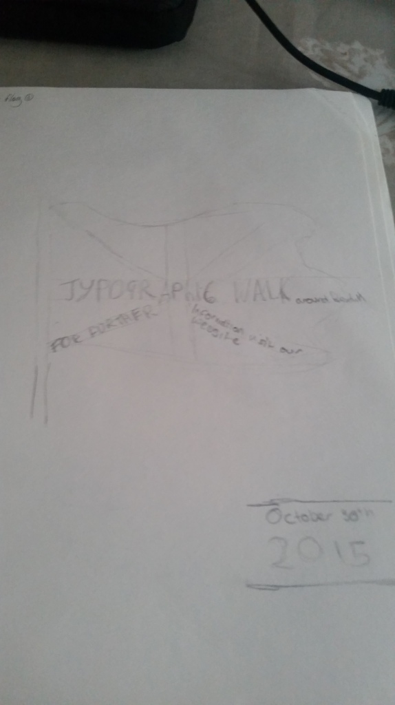
Flag Design

I don’t really like this design. I think the important text may get lost and the imagery doesn’t work.

20151016_155757

I’m not an artist by any means, however I thought sketching things out and not feeling embarrassed by the poor quality was incredibly handy just to get ideas down and how the design could be arranged. I also found that sketching one idea actually triggered another. I found its important to filter out any ideas quickly that won’t work for any reason, and stick to something realistic in the time given.

20151016_155852 20151016_155839

PMI of designs

In this blog post i want to explore what went well and not so well with the project and each individual piece.

Type_walk_poster

I’ll start with my initial design.

+

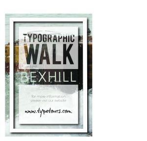
I like the frame around the text idea, and the clipped text to the image behind

I also like the how the bold bebas font combines with the light weighted font used in “bexhill”

I don’t like the font used at the bottom, I now on reflection think it clashes with the other fonts and draws the eye to lesser information

The image is lost, and not really relevant. I think at this stage of my design process I was thinking to much about where it was, and not focusing on the audience the poster should be targeting.

Interesting

The frame and box in the middle I think is quite an interesting idea, and has a lot of potential. I’ve learnt alot from this design, not only on illustrator, but not be scared to fail and evaluating the good and bad parts will make my final piece hopefully a lot better!

Type_walk_poster_03

My next idea stems from the scenery I saw around bexhill. As soon as I got to Bexhill, it felt like travelling in a time machine. A place where people retire and grow old. I found the serif typeface on the seafront on a tourist information board. I wrote down a few things that might lead to a good design:

  • Gold/Black
  • Royalty
  • Simplicity
  • Old
  • Black and white
  • Army
  • Queen

+

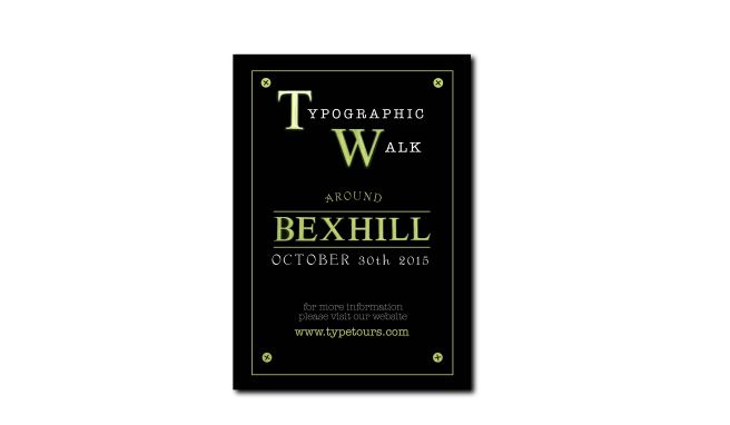
I like the type combinations used in the design, I think they compliment each other well in weight, colour. The typewriter font used was inspired by a design seen in the De La Warr Pavillion. I thought it summed the place up, and took me back to the war. This also links in with my research where I found army plaques and memorials all around the seafront, linking to the wars.

Fading from green through to purple

I think it may be too simplistic, and might not attract the sophisticated typographer. I also don’t like the gold border around the design, I’m not sure what it adds to the design and if it has any relevant messages.

Interesting.

The type works well and conveys the right messages to the intended audience.

Designs that didn’t work so well

Type_walk_poster_04

This design, although basic and incomplete, is lost doesn’t draw the eye. Also the alignment of the text makes it very difficult to arrange the other text, and there is quite a lot to fit in.

box_Design

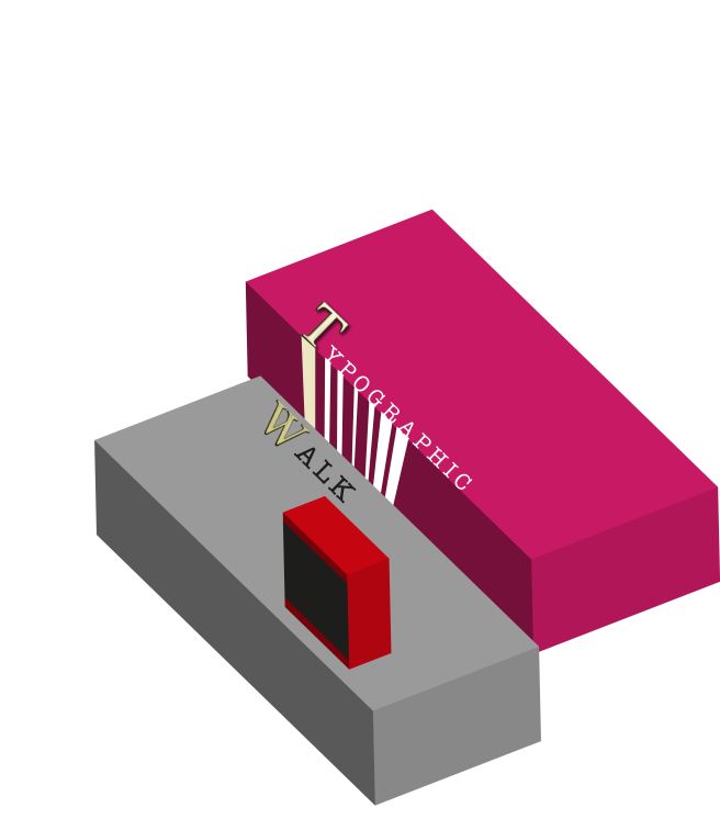
I like the 3D effect of this design, and I think it has potential to be really interesting and eye catching. Given my basic knowledge of illustrator, I felt like I could spend day and night trying to perfect the design but not actually get very far. Given the time constraints I decided to abandon the idea.

BOX_DESIGN_02

Again I think this had the potential to become a good design, but I reverted to something more simple in the end. the 3D effect could be used to extrude from the wall and draw the eye in.

FootprintI wanted to incorporate footprints in the design to get the message across without the text being read. Its a variation on another design, and i think it does would well, though I don’t the the colour scheme quite works.

The Audience and further designs

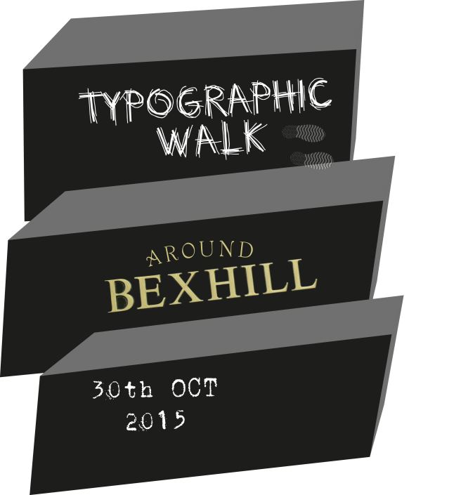
Tonight i’ve been developing my typographic poster, and one thing i’m noticing is that I have all these weird and wonderful ideas, but keep diverting my attention away from who my poster is targeting. I want fellow type enthusiasts, graphic designers, and professionals to notice the design, and this means I need to use interesting type in a visually interesting way. I went back to my images and my 100 ideas, and looked at what else i could use and develop, thinking about the what type would work well together on a poster that needed to be noticed from afar. I created a modernist type of design, very minimalistic, using the important information in a rectangular formation, and using a light blue to differentiate between ‘Typographic Walk” and “30th October 2015”. I chose blue because it was in keeping with the both the sea theme, and the blue skies. I used a hand painted T  in typographic, sourced in Bexhill. I feel it gives the design a personal feel touch, in an area where art and design flares, and the beautiful landscapes inspire. I wanted to incorporate  some sort of imagery in the design. I found a picture i took of a seagull on top of one of the iconic domes on the seafront. The dome shape worked well when i put the text “around” around it, drawing a circle with the ellipse tool and then using type on a path. Something I struggled with was the positioning of the “for further information, visit our website, http://www.typetours.com” segment. i think the design would have looked better if everything was aligned centre, however I felt the space wouldn’t allow me to do so without the design looking cramped and not easily read. I did however like the simplicity of the piece, and it leant itself well to the peaceful seaside town. I tried to apply the principles of C.R.A.P when designing this piece, contrast in the type, and colour of the text, repetition can be seen in the blue text, alignment, centred, but not all centred. Examples of proximity can be seen in the grouping of the linked information, with appropriate spacing between each section.

poster_05

I think i will use this design for my final piece. Out of all my designs, I think it meets the brief appropriately. I like how all the information is positioned, and i also like the typefaces used in the design.I also like how I have incorporated quite an iconic piece of design in the dome pavilion, with the seagull centred. I don’t however like the image I’ve used for the T. Im not sure it quite adds anything.

Typographic Poster Designs Illustator research/development

I first of all got some ideas down on paper. This process made me think about the layout and positioning of both the type images and the imagery. I wanted to make sure people knew it was a typography walk instantly within the first few seconds of looking at it. I tried a few designs out on illustrator. Here is an example of something i really liked, but I didn’t think it screamed ‘Typographic Walk’ as the typefaces are very plain, sans serif, and they’re almost used as images instead of type. Also, i think the image behind is slightly lost, I don’t want to detract from the type purpose and message. What I do like about the design is the border and box in the middle with a drop shadow added as an effect, gives depth to the piece, and although the image is lost behind in the instance, I think its quite a powerful technique and will remember this for future designs.Type_walk_poster

Below is a screenshot of how I stacked my layers. This is something I came onto the course to learn more about, and I’m actually beginning to understand this more and more, day by day.

Screen Shot 2015-10-11 at 19.51.44

I had a re-think. I wanted to design something simple but effective. The text had to stand out, being a poster that had to appeal to typographic enthusiasts. I reverted back to my images to find other interesting examples of type, and how the examples could integrate with other elements.

I found some really interesting golden serif type from a tourist information sign. The type was set on a black painted background, saying “Welcome To Bexhill”. I think a serif typeface will improve readability, and has connotations of age, and formality. I used the “T” and the “W” in the heading “Typographic Walk” to emphasis the characters. I used it in conjunction with a san-serif typeface in white, adding contrast.

I chose another stylised serif font, drew an ellipse, and used the type on a path tool to make the ‘around’ go around the path. I did this so people don’t have to read the word to get the message. I thought about the hierarchy of the text given in the breif, what was the more important and what was less important.  I emphasised ‘Bexhill’ by putting the text between two lines, as people needed to know where the event was taking place. It was also important to think about what order the poster should be read. This gave me a structure when it came to picking fonts, font weights, and point sizes. Here is what I came up with.Type_walk_poster_03

World Illustrator Awards – Sommerset House

Today, we visited Sommerset House in London to explore the World Illustrator Awards 2015. Looking around the exhibit was great for gathering inspiration for the design of my typographic poster.

I particularly liked a piece produced by Gail Armstrong, where she combines coloured, patterned and textured paper in different layers, giving the design depth and texture. The dress of the woman to the left of the piece is textured and the audience can almost get a sense of the feel just from looking. I really like this, and hope to implement some sort of texture in my design The use of different layers’ casts natural shadow on the layers below, this can be seen clearly from the woman bottom right of the piece. I also absolutely love the white doves come out of the frame and flying up and beyond up the wall. It makes the eye travel outside the frame. Also, I noticed the positioning and scale of the doves. The smaller doves looked further away and the larger a lot closer to me.

Gail Armstrong - SAGO
Gail Armstrong – SAGO

The design was clearly aimed at a female audience, with shopping and indulgence the main themes. The piece was designed for the 29th anniversary of a department store called SAGO, Hong Kong. Gail has also designed pieces for M&S, Rowntree’s Randoms, and Aero. I really like the style of her work, very simple shapes, curves, lines and colours. Shadows are clearly a really effective tool to add depth to a design, and this is something that I will try and explore when I’m designing my typographic poster.

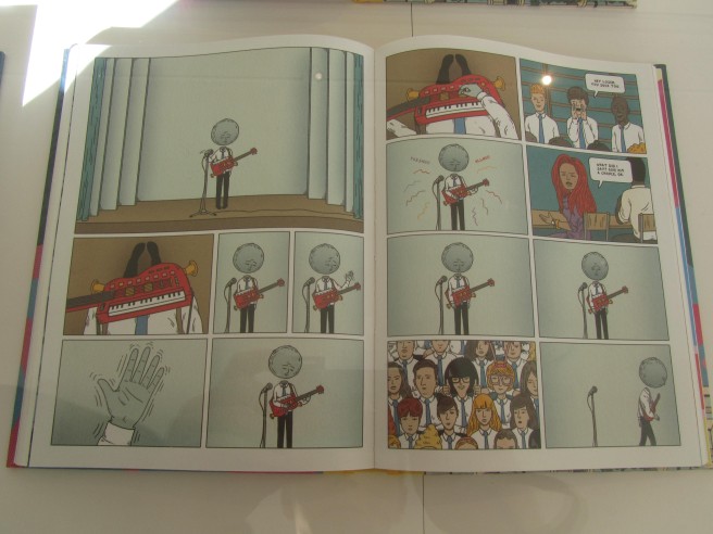
Another piece that gave me some inspiration for my typographic poster was by Andrew Rae, using simple lines to display movement of a hand. It sparked an idea in my head, to use stones falling, and bouncing off a character positioned center of the poster. Below is a sketch of my idea, and will be going into my 100 ideas in my notebook.

Idea Sketch
Idea Sketch

IMG_0660

Malika Favre was given a brief by BFTA to produce a piece that captured the glamour and anticipation of its prestigious film awards. Malika used very simple outlines of human shapes, with directional light or a spotlight on the character to cast a shadow, giving depth and also fulfilling the brief, as stars will be in the spotlight at the BAFTA awards. The imagery fills the majority of the page, drawing the eye in, with the relevant information placed in the bottom two corners.

Malika Favre BAFTA design

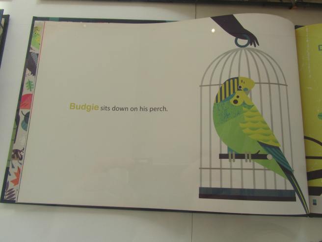
Finally, I’d like to talk about a design by Owen Davey, who combines hand drawings with digital design. One thing I picked out from this design was the alignment and composition of the imagery and text. The rule of thirds is used roughly with this piece. The text is aligned to the left and centered between two of the thirds, whilst the image sits to the far right third of the page. The text is a single line, and the white space around it makes the words seem more prominent, as if every word is important and must be read. I also like the repetition of colour between the word budgie, and the green budgie to the right.

IMG_0674

So to conclude, I really enjoyed the exhibition. I feel like I have gathered loads of new ideas in the printing, illustration and texture of my design for the typographic walk. I’m not a very confident artist at all, however I was inspired by seeing accomplished artists at the exhibition use simple shapes and colour schemes to create incredibly beautiful pieces of design. It was also interesting to see examples of their rough initial sketches, and how rough they can actually be. Its all about getting the ideas down on paper, no matter how bizarre they may be, they can be filtered out eventually.