FMP – Sketchapp – Initial Attempt

After scamping my idea out, I jumped into the the digital design quite quickly, as I was worried about time constraints given my ambitious project. The screens below show my intitial efforts. Although rough, it show the user journey, and could be tweaked into a more coherent design later. I became frustrated very quickly with my progress, so took to the web to gather more information after this process.

Screenshot 2018-05-31 20.10.15Screenshot 2018-05-31 20.10.28

FMP – Prototype Development – Invision

Working in an organised fashion, I created order between the screens in the dashboard, making it easy to understand the userflow, and not getting confused between screens.

Screenshot 2018-05-31 16.00.58.png

During this process, new ideas sparked about how to transition between screens, and animate, increasing the user experience to a new level. This is evident in the take a selfie screens, where I animated a white screen between two other screens. This was done by creating a new artboard in Sketchapp, and filling it with white and reducing the opacity slightly. I then exported this element as a PNG file, maintaining the transparency effect, and created a timer in Invision, transitioning quickly to the next screen “continue”.

Screenshot 2018-05-31 16.04.17Screenshot 2018-05-31 16.04.28

FMP – Prototype Development – Sketchapp

Now normally I’d be panicking about leaving the prototype to the final day to complete. However, I already had the bare bones and structure to the design, so really, all I had to do was follow the story, and create links between the screens I had created in Sketch.

After animating my screens in After Effects, my Sketch app file was all over the place, and had been dissected and moved around to export all the elements. So I decided to create a duplicate file, and tidy up the screens, showing the user journey from start to finish.

Screenshot 2018-05-31 15.54.11Screenshot 2018-05-31 15.54.15

Using Invision and the Craft plugin, I was able to quickly make changes to the design file in Sketchapp, and sync the changes directly to my prototype, allowing fast workflow.

Screenshot 2018-05-31 15.58.01.png


FMP – Existing Shoe Companies Research

To further understand my audience, I wanted to look at what other established shoe brands are doing to target their specific audiences. This will give me an insight into what other brands are doing well and not so well, and attempt to design a better platform for the end consumer.

Nike App

Although the app is incredibly easy to navigate, it feels very sterile, not very exciting, and too clinical. These ideologies represent the Nike brand well, showing speed and efficiency.

The imagery used is very “cool”, showing you males in provocative, moody poses, highlight the shoes, but providing the audience with an aspirational image that, by association, makes the brand “cool” and youthful.

Screenshot_20180529-112137

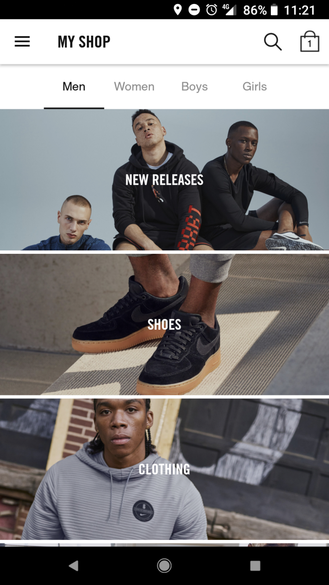
The user can easily navigate through the app, finding product ins specific categories. These categories funnel the user down, to show them products they really want to be seeing.

Screenshot_20180529-112144

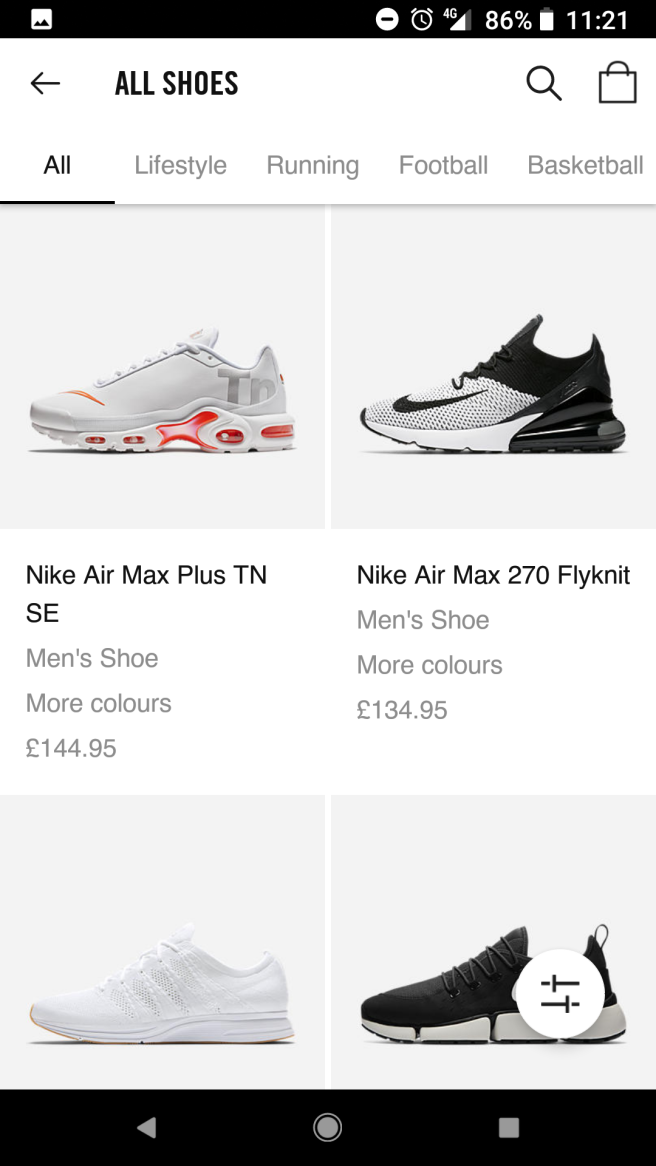
Again, the product detail page is very stripped back, simplistic, but serves a purpose and ties in well with the brand. The navigation is consistent throughout the design, making it easy for the user to navigate through the app. The price of the product is always visible at the bottom of the screen, making it easy for the consumer to purchase the product at any point of the during scroll.

Screenshot_20180529-112153

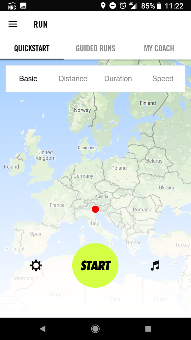
Nike Running Club App

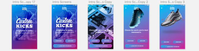
Like many apps I’ve looked at, intro screens usually help the user understand the conventions of the app. It shows the user how to use the app, whilst also setting up an account to store personal preference data, such as specific interests, show size, location services etc. This information is then stored, and can be used to push specific products to consumers based on their personal interests.
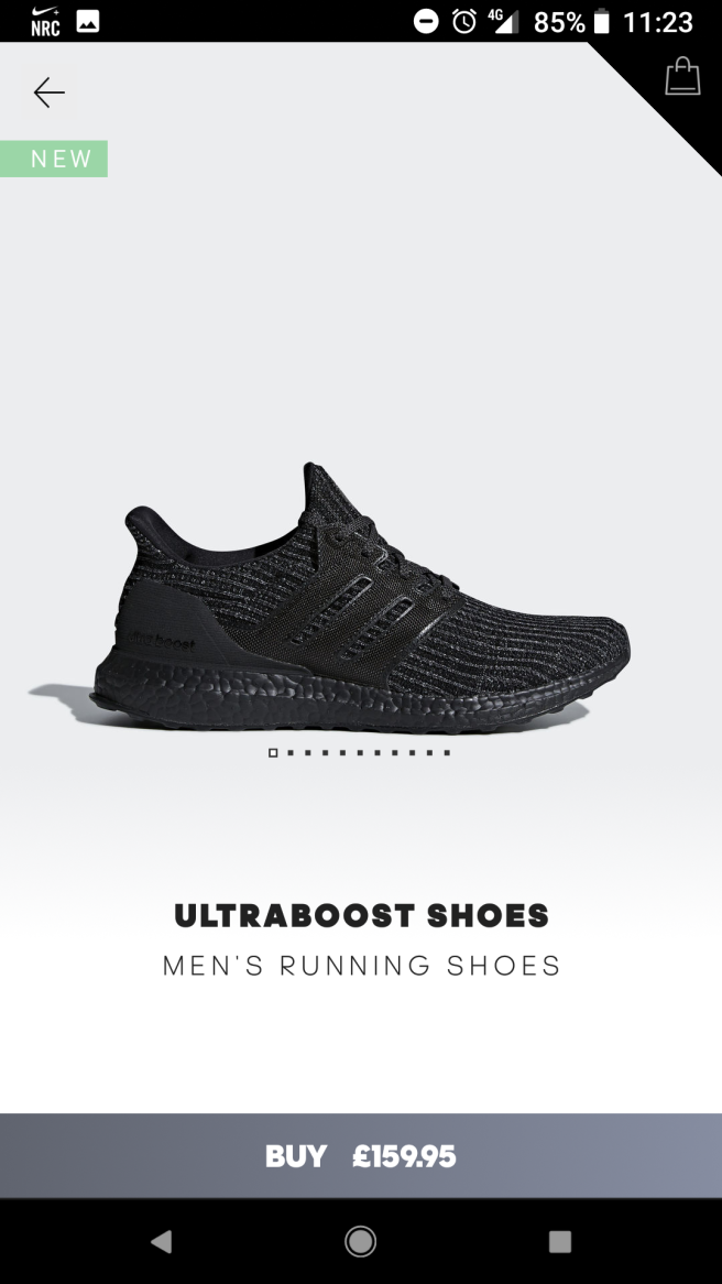
Screenshot_20180529-112227Screenshot_20180529-112238Screenshot_20180529-112252

Adidas

A more stylised approach, giving a bespoke, designed feel to the app and brand. To the consumer, this gives a sense a personalisation, something the consumer craves. The sharp diagonal lines encourage the notion of speed, something performance sports brands seem to have in common.

Screenshot_20180529-112312

I like how many of the apps use a very neutral colour, such as whites, greys, and blacks, that draw focus to the shoe its self. Other colours could distract the consumer from the main focal point, and this could translate into a mis sale.

Screenshot_20180529-112323

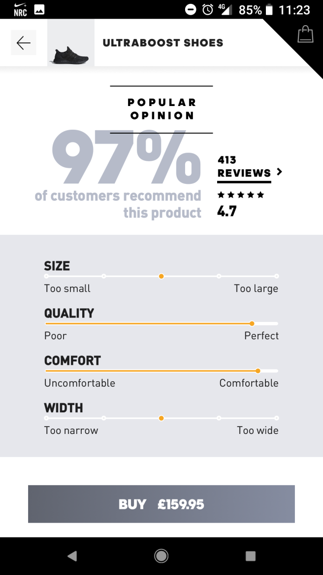
Infographics and reviews provide the consumer with previous customer experiences with the product, providing justification and reassurance about to the consumer.

The consumer can choose from the following categories to score out of 5 on the scale:

  • Size
  • Quality
  • Width
  • Comfort

Overlapping elements provide a further stylised feel, reducing the opacity to draw importance to the darker text.

Screenshot_20180529-112332


Reflections

This process has been really useful to see what’s already been done. Recently, I watch a TED talk about the development of ideas. Many ideas are usually solid, for example, the concept behind MySpace, Bebo, was actually a great idea. Social media boomed around this time, but facebook didn’t jump straight into the social media market. They saw what Myspace and Bebo were doing, and looked to improve on the platform to try and appeal to the mass audience. The UX of MySpace wasn’t the best. If you understood MySpace, you were considered a social media genius. Facebook developed their platform, changing an idea that had already been invented. Today, Facebook is the largest social media platform that has continued to innovate and grow as an organisation.

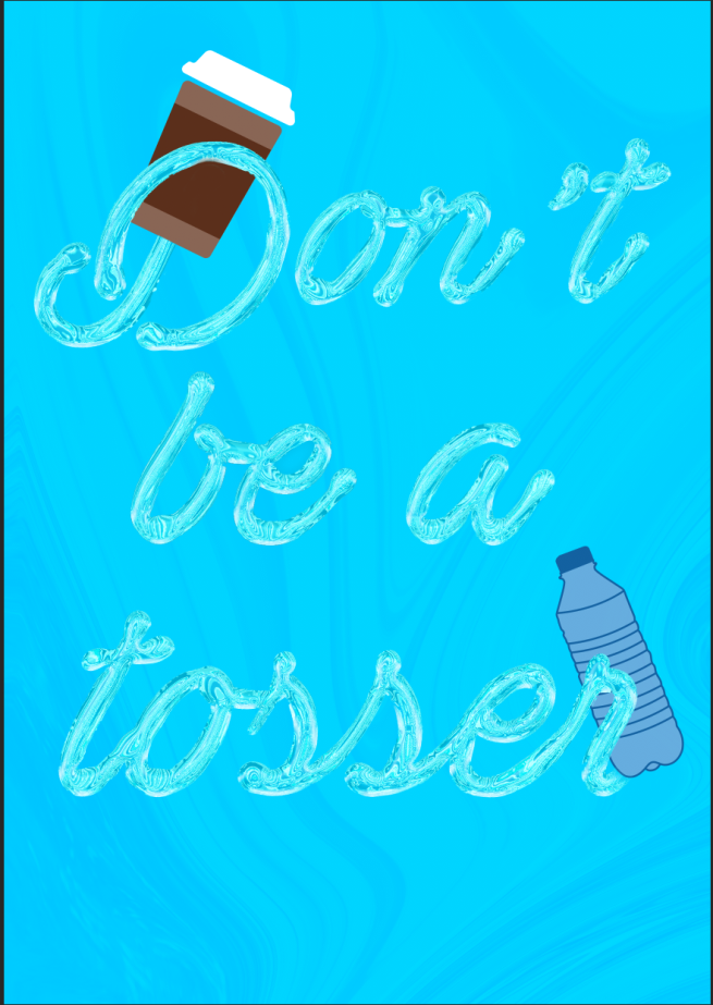
My point is, their are sure to be a huge amount of shoe apps out their doing a similar thing, but how can this be improved upon. What can I do differently to the my other competitors that will make me stand out. These questions are to be considered in the early stages of the design process.

FMP – Developement

After finishing comping together my screens, I moved on to consider what promotional material I could produce, announcing the brand in a way that would excite my intended audience. After a lot of consideration, I decided upon my target demographic being very young, between 16-30, however the app could work for everyone. I wanted to encourage the idea of “coolness”, showing the audience what they aspire to be like, whilst tying in the brand and house style.

Creating layers, I found stock videos of skater scenes that encourage the idea of coolness. The New York and California scenery, with palm tress and plenty of sun, shows the audience “the high life”, showing them they can have a taste of this life by personalising your favourite shoes in a quick and easy manner. I used multiple layers of colour correction, tinkering with the style and vibe of the final composition. These layers included:

  • Lumetri Colour Adjustment – Giving a professional video colour grading
  • Noise, Blur & Blending Modes – After feedback from my mentor at work, he taught me a quick and cheap trick to enhance the colours, adding a small amount of blur, noise, and then reducing the opacity to next to nothing, and chaning the colour mode to suit the peice, just to make the colour pop.


FMP – New Software Skills: Adobe After Effects

I, like everyone else, love animation. It can bring a still, flat design into a exciting, dynamic piece, engaging the audience through motion. I’ve been fascinated with Adobe After Effects, watching tutorials online and trying to understand how to get the best out of it to animate my screens. I’ve worked on a small animations at work but found it really difficult to get my head around it sometimes, which made me put off touching it for my FMP initially.

One day at work, I sparked an idea that I wanted a fingerprint for a fingerprint recognition screen in an app I was designing. I sat down with my mentor, who took me through step by step how I can animate a mask from point A to point B in time. The repetitive process of animating each individual stroke of the fingerprint was like a lightbulb moment. I suddenly grasped the concept of animation.

That weekend, I took what I had already in terms of screens in Sketch, and exported each element of the screen that I wanted to animate, and the background plain.

Wordpress_New_software.gif

Using different comps to group screens together and transition between screens, I was able to remain organised.

Animation_01_start_6.gifInsta_upload_animation.gif


SEK Bomb Project – Mockups

I’ve recently been working on my presentation skills, trying to sell an idea or concept to a client. In the previous project, we looked at loads of different ways to be creative when presenting, and I wanted to continue to develop this skill in this project.

My plan was to create a small PDF outlining my process, starting with a mood board of everything I had looked at to gather design inspiration from. This gives the client an idea of the path I took to get to my end resolution.

I also wanted to show how the display would look like in real world context. I took to the internet to find some appropriate scenarios that could help me. I wanted to visually demonstrate how the banner would work at the exhibition, showing a silhouette of characters standing in front of the display, and a small table that would be positioned in front of the banner.


Below are the completed mockups to present to the client:

SEK mockup 1Mockup_display_sek

Micro Projects

A few nights a week, I’ve been trying to find time to look at youtube to teach me something new, whether it be photoshop, illustrator, or after effects. Since starting a new design job, I feel I’m lacking in technical ability and need to strengthen my understanding of tools in all programs to move my work on to the next level, with more attention to detail.

Below are a few examples of my work:

Ed_type_02Steph_Typeline_type_02line_type_03line_type_04PrintPrintInsta_02Portrait_typeMemphis-01Halftone_EdDripPrintFAULTY.gif

Project X – Design Process

For our display, we wanted to created a banner and a graphic for the front page of the leaflet we intended to produce, which was light hearted and enticed the intended audience in. To do this, I felt a script font would be an appropriate choice of typeface as its informal tone lent itself well to the intended outcome. I wanted to convey the idea of fluidity, tying in with our theme, the ocean.

I started by descreasing the leading, the spacing between the characters, to give a fluid feel to the typeface.

Screenshot 2018-02-05 20.51.09

I then added a lighting effect to give directional light and shadows to the typeface. This would add a three dimensional feel to the typography, and a sense of realism. Screenshot 2018-02-05 20.48.02


I then started to think about the effect. I added a chrome style to the typeface, using a preset in the filter gallery. This was the beggining of the “fluid” style.

Screenshot 2018-02-05 20.48.09Screenshot 2018-02-05 20.48.13

I then added further shadow to the back of the typeface to give more realism and dimension.

Screenshot 2018-02-05 20.48.16

I then warped the text using a liquify filter to bulge the type were I felt appropriate, focusing the bulging on the bottom elements of the characters, and also where the characters joined. The end result, I felt, was quite effective.

Screenshot 2018-02-05 20.48.45

I then used the liquify filter again, using an image with multiple tones of blue, and warping the text to give a spiral effect. I added this with a soft light blending mode behind the text to further anchor the idea of the ocean. Screenshot 2018-02-05 21.05.49.png

Screenshot 2018-02-05 21.08.32Screenshot 2018-02-05 21.08.53

Screenshot 2018-02-05 21.13.27.png

Project X – Display Day

Today was the day our display would be showcased to the college in the canteen. Looking at how everybody had presented their information on their chosen topic, I found it interesting how everyone had collaborated and generated different ideas to entice the audience in and engage them in debate. I think it’s important to reflect not only on our own design piece, but everyone elses too, as there were some interesting styles and techniques used that I found interesting, and also felt quite jealous that they were able to execute them so well!

Other Groups

One particular display I think everyone enjoyed was “Say no to recycling”. The group adopted a Andy Warhol pop art style, which didn’t necessarily link to the topic, but did entice the intended audience with bright, vibrant colours and interesting visuals. They created leaflets that were handed out to from the stall, and also created a bin to illustrate the problem. I thought the halftone effect was very eye catching, and married well with the pink and yellow type, and the blue background. The colour palette was well thought out and is something that I will remember and use in future projects!26295306_1920207174962072_385637008904552448_n.jpg

Another display that was quite under appreciated (in my view) was the eco building, showing how plants could cleanse the air in built up cities. The interesting element of the display was the 3D model created by Dan. I know how much time and effort goes into 3D modelling, and it’s by no means easy. I think because it has become expected in modern design, it often gets overlooked and under appreciated. However, I think he did a fantastic job and has a lot of talent! I asked him what software he used, and it was Cinema 4D, a program that I had previously encountered from tutorials on youtube. Its certainly an area I want to explore and feel inspired by his design. The display its self was clear and easy to understand, and I thought it was a nice touch that the feedback was handed out on clouds, which were later tied to the table to further strengthen the purpose of the design.

Our Group

Overall, I think the design was well received. The issue itself has been quite prominent in the media recently, yet I don’t think people understood where and how plastic waste ends up in the ocean. People were shocked with the amount of time it took for a nappy to biodegrade in the ocean, and this shock factor could have been exploited further. It was a good exercise to gain initial feedback, and one key point was that we only focused on the negative aspects of the issue. Many people wanted to know how they themselves could make a difference, and this is something we had missed.

Also, it was clear that other groups had focused on what the audience could take away from the design to remember the issue, in the form of leaflets and cards. Again, this could have been added to our display with more appealing visuals that could have encouraged a positive reaction.

Our idea was to “fish for fish”. Initially, I pushed the idea of fishing for facts, which was overlooked by the group. However, feedback suggests that the plastic fish were distracting from the overall purpose of the design, and perhaps I should have been more forceful in pushing my idea if it was to benefit the group design.

In term of the group dynamics, I’ll admit i’ve found it difficult to communicate with them effectively. I’ve found that a lot of the time, someone may suggest an idea and it is too quickly adopted and the ideal solution, without exploring all possible angle, despite how ridiculous or unachievable they might be. I think it’s important to always push the boundaries, especially in the development stage, and consider the intended audiences needs. It was clear to see other groups had worked well together in collaborating ideas and working to each others strengths.

Many times during this project, I’ve looked looked around the room and noticed every group conversing and generating fresh ideas. Nothing was dismissed straight away. I don’t want to seem like I’m moaning about my group, however I do want to get a better grasp in the final week of this task and try and lead the group to achieve the best possible outcome possible. A lot of negativity seems to be in the air at the moment about the overall purpose of the subject, but that’s just design. Often as designers, we won’t be able to pick and choose who and what we work on or with. So I think this is an exercise of perseverance, and I think the group attitude needs to change in order to achieve a good outcome.

IMG_20180130_083232.jpg