Project X – Dirty Beach

Dirty Beach are Brighton-based artists Chloe Hanks and Lou McCurdy. The name is a nod to “saucy” seaside postcards of yesteryear and typifies the humour and satire that characterises their work.

about3

Initially, the pair exhibited individual art works under the name “Dirty Beach”. After noticing the increasing amount of rubbish dumped on their doorstep and beach, they began developing an installation concept, immersing consumers in a fully fitted “supermarket” that mimics the visual language of large modern-day retailers, however, stocking reclaimed discarded plastic items from the beach.

about6

The project aims to inspire awareness of the issue surrounding not just Brighton, but every coastal town across the world, using humour and mimicry to create an installation that is simultaneously proactive, popular & accessible.

about4

Takeaway:

Again, this is a good demonstration of how the public can fully immerse themselves in an issue without becoming bored or bombarded by masses of information. It appeals to their natural instincts and poses the question ‘is this right?’. The provocative artwork stimulates debate and encourages people to dispose of there waste plastic correctly. Moving forward with Project X, I feel this has given me masses of inspiration that covers both art, and activism in a light-hearted way.

Project X – #SquareMileChallenge

As part of my research for Project X, I scoured the internet for design inspiration and campaigns already in existence. This is an important part of my design process, and one that I often overlook. It enables me to generate new, fresh ideas from peoples design experiences to propose a solution to the design problem.

One particular campaign that inspired me the #SquareMileChallenge, appealing to people to recycle their coffee cups. In central London, there are 131 coffee shops in a square mile, hence the campaign name #SquareMileChallenge.

The Problem:

  • 7 million coffee cups are binned everyday
  • Less that 1% are recycled

The solution

Over 100 bright yellow bins were positioned around the square mile. The aim is to collect half a million coffee cups in a month, and 5 million in a year. The material will then be recycled and new products will be made to demonstrate how this can be achieved.

I thought it was interesting how they caught every day working peoples attention by using a variety of different techniques.

I particularly liked this video below. It uses a discarded coffee cup on the characterised by cartoon-like facial features, and a speaker embedded inside the coffee cup to communicate with the target audience. As the public walked passed, someone hidden in the bushes would talk to the target through a microphone in a lighthearted manner, asking them to physically pick the coffee cup up and place it into the bright yellow bin. This was then documented with a camera and posted all over social media, gathering momentum for the campaign whilst raising awareness of the problem and the proposed solution.


Project X – Foil Blocking & Green Patriot Posters Class Presentation

We were given the task of researching and presenting a couple of different cases, that might not directly fit into our specific topic in Project X, but made us think about systems thinking, and the most effective way to present ideas to a large audience. At this stage, admittedly I was a little overwhelmed and didn’t understand the relevance of the task in relation to Project X, and felt we were being pulled in loads of different directions and bombarded with work. I understand that this was an attempt to replicate a real professional design experience, however I don’t think it helped me learn the information effectively as I felt very confused about the task it self. Despite this, I pressed ahead and learned the information myself to grasp the concept of both foil blocking and green patriots poster, and the relevance to the environment. A small change can make a big difference.

As a group, we decided to show large visuals with background information, in the form of a display that people could view and read. In hindsight, we could have developed the presentation further, and engaged our audience more by appealing to multiple human senses, not just sight. We walked around other groups displays and dissected their displays, analysing what we liked and didn’t like, what was memorable, and what we could take forward into the next stage of Project X that would enhance our own outcomes.

Feedback suggests that the display was too text heavy for our classmates, and our method of displaying information could do with development.

IMG_20180109_142541-1.jpg

Some of the better displays engaged with there audience in various different ways. The display below used large type and strong visuals to entice the audience, whilst displaying the information in a clear and concise manner.

IMG_20180109_135357-1.jpg

I also like the presentation captured below. Instead of using flat images and text in the form of a poster, another group appealed to our humanly sense of touch, encouraging us to interact with their display by opening a box, tying in with their case study. I thought this was an effective way to add another dynamic to the overall experience of learning. Although the information itself was quite dry, the group were able to evoke a positive reaction from many in the class, by changing the approach at which we learn.

IMG_20180109_140652-1.jpg

I liked how this group visually represented how easy it was to gather information from social media across the world. The text elements of the display anchored the display, giving context to audience. This method made it clear and easy to absorb the information and made it more interesting to learn.

IMG_20180112_134928.jpg

Takeaway

My takeaway from this session in particular was to think about the most effective way to learn information. It gave me the opportunity to dissect everyones methods of displaying information, and understand what worked for myself and others, and what didn’t. I did however, find it hard to establish a link between this exercise and Project X, apart from our presentation skills to an audience that didn’t know the subject well. In some case studies, it was easy to see how this could enhance our knowledge of systems thinking, but some weren’t so obvious. On the whole, I think this was a positive experience and wish to take what I’ve learnt forward into the next stage of Project X.


Project X – Case Study Presentation: XU Bing Forest Project

We were given the task of thinking about the most effective way to present ideas to our fellow class mates, thinking about how they might engage with the case study and learn the information the best possible way.

I myself, opted to use a simple approach, using a poster and short concise bullet points to illustrate the case study. Using feedback from the previous presentation, and my own previous learning experiences, I find it easiest to learn through large visuals and little text, so the user isn’t overwhelmed and bombarded with vast amounts of information. I wanted to distill the point of the case study to its purest form, using typography and large, strong visuals to engage my target audience.

Below is my screen I produced for the presentation:

XU_Bing_Poster.jpg

I gained some valuable feedback on my presentation. Although some felt the information was clear and easy to follow and understand, many felt it was ok but could develop further. My classmates felt the imagery was clear, however, there could be some more background information on the artist to give context to the design, which was an oversight on my part as I’d done a vast amount of research but just chose the relevant information to put into the display.

IMG_20180112_144226.jpg

After viewing other people ideas to display information, it made me think about the relationship between this exercise and Project X. We are going to be speaking to people through visual communication to stimulate debate and spark conversation on our given topic, which they will no next to nothing about. Its imperative that we engage them and make it “fun” in order for them to learn the information we want to get across and, hopefully, make a change for the better. Some of the best displays exploited a variety of different human senses I noticed, such as smell, touch & sound, not just what they could see. This left a memorable experience for the user, in which they can recall at a later date.

IMG_20180112_134928.jpgIMG_20180112_135434.jpgIMG_20180112_134712.jpgIMG_20180112_135439.jpgIMG_20180112_135231.jpgIMG_20180112_135229.jpg

Takeaway

My main takeaway from this session was to think about different human senses when displaying information, and using gamification to encourage a positive reaction from the target audience. This is something I wish to strengthen as the project progresses.

Project X – Tims Recap/Reflection Session

Following a week of intense classes for Project X, many of us felt uncertain and slightly lost about the direction the project was going. A lot of us had concerns such as:

  • Deliverables – What is the final outcome going to be? How are we going to make a “provotype”?
  • Deadlines – When? Where? How?
  • Why we were looking at such divergent topics?
  • Why we were presenting abstract case studies? How do they relate to Project X?

I myself, felt bombarded with new knowledge and work, and trying to piece together what was due in for when was what I was particularly struggling with. Also, getting my head around the direction the project was going was also a concern.

I’ve found it difficult to communicate with my group at times. Many group members either don’t seem interested in the project, or have a negative approach, wanting to just get the work done in the quickest and most efficient way possible, without pushing the boundaries and thinking about how we can develop an idea.

During the session with Tim, (my tutor) I was able to voice my concerns, which in itself was helpful. Tim asked us to think about how we might address these issues. I think in my case, I need to try and show some sort of leadership, especially being a mature student and on the BA, stimulating debate and conversation amongst the group in order to generate a large pool of ideas and sub-topics within our given discipline (waste & pollution).

My main takeaway from Tims session was to consider the end user, asking myself how we can effectively engage the target audience, college students, in something they may not naturally take interest in. In slide 7 of Tims presentation to us, really resonated with me. He asked us to right a short sentence about how to restate the problem in a systematic way, using this framework:

“Redesign the [ topic ] experience for [ user ].”

Eg,. Redesign the social experiences of the elderly living alone. Redesign the public park experience to encourage the fitness of families

This enabled me to simplify everything we’ve learnt in the last week, and gain a greater perspective on what the project could achieve, and the direction the project could go in. I took a short time to think about my answer, and came up with the following:

Redesign the experience of the disposal of plastic waste, using gamification to engage the end user.

Everything seems a little up in the air at the moment, which I think is the source of my own anxiety over the project. However, next week is a new week, and I think it’s important we pull together as a group.

I think this short simplification class has been invaluable to me. I’ve grasped a better idea of the project, and been able to consider the needs of the end user, asking myself “what will make my end user happy”. From this, I’ve already been able to generate ideas, which I wasn’t able to do before due to the lack of understanding and uncertainty of the outcomes of the project. I feel like I’m now able to move forward into next week and relay what I’ve learnt with my group, enhancing our project collectively.

Slide1Slide2Slide3Slide4Slide5Slide6Slide7Slide8Slide9

IMG_20180113_172022.jpgIMG_20180113_172016.jpg

Project X – Systems thinking

As part of the background research for Project X, we had a class teaching us about systems thinking, making us more aware of the natural issues, and the complex world we live in.

What is Systems Thinking?

A system is a set of interrelated elements that make a unified whole. Individual things—like plants, people, schools, watersheds, or economies—are themselves systems and at the same time cannot be fully understood apart from the larger systems in which they exist.

Systems thinking is an essential part of schooling for sustainability. A systems approach helps young people understand the complexity of the world around them and encourages them to think in terms of relationships, connectedness, and context.

One lesson that nature teaches is that everything in the world is connected to other things. John Muir famously wrote, “When we try to pick out anything by itself, we find it hitched to everything else in the universe.”

Systems thinking is particularly useful in addressing complex or wicked problem situations. These problems cannot be solved by any one actor, any more than a complex system can be fully understood from only one perspective. Moreover, because complex adaptive systems are continually evolving, systems thinking is oriented towards organisational and social learning – and adaptive management.

Project X – Foil Blocking

Definition:

Foil blocking (or hot foil stamping) is the process of applying metallic or pigment foil to paper or card, where a heated die is stamped onto the foil. 

To tackle the foil side of sustainability, a new study on the recyclability and repulpability of foil-decorated stock and board recently was commissioned by the FSEA through a third-party research firm – Pira International, Surrey, UK.

It finds in a 14 page document that both hot and cold foil stamping are sustainable methods of decorating recyclable products. To strengthen the sustainability of the process, the FSEA is currently investigating ways the foil can be completely removed from the carrier (after applied on-press) before it is re-rolled. Second, the FSEA is in the process of determining what types of recycling options are available with the used foil still on the polyester film carrier.

A de-inking process removes the foil, film laminate, or transfer metalled material from a paper or board substrate. Companies that manufacture and supply film and foil laminated board have had the ability to recycle scrap for many years using a de-inking process that separates the laminate from the board. Then the fibre in the board is recaptured and sold for secondary market pulp. This shows the ability for the process to be sustainable, and shouldn’t be misconstrued with other techniques used that are less so.


Project X – Trip to Brighton: #StreetsAhead

On Saturday, my family and I took a trip to Brighton to see the sights. Inadvertently, I stumbled across a grotesque sculpture of a fish made of discarded plastic, displayed in a large display case in a popular tourist spot in the city. It caught my eye and intrigued me so went to find out more. The purpose of the sculpture was to raise awareness of a prominent issue in the city, ocean plastic waste.

Rebecca Dove, managing director of Hubbub said, “The amount of litter entering the sea is massive, and increasing. 35% of fish off the coast of Britain have plastic in their gut and 80% of ocean plastic comes from land-based sources. Litter in the sea takes centuries to break down and is harmful to birds, fish and other species. Brighton has a fantastic opportunity to lead the solution to tackle the issue of litter entering the sea along Britain’s coastline which is contributing to a pressing global issue.”

FFS_Brighton_Hubbub_pebble_magazine2.jpg

Although the fish sculpture doesn’t directly interact with the audience, it poses a strong statement, defining the fish as a piece of plastic. It attempts to pull on the heart strings of the public visiting Brighton, to be more conscious of their disposal of plastics, and make sure it doesn’t end up in the see, and ultimately, in fishes guts.

I feel this initiative perfectly ties into what we’ve learnt (so far) for Project X, attempting to provoke a reaction from both tourists and residents to try and keep our seas free from plastics. This issue relates to the Tragedy of Commons explored in a previous post, which outlines the effect we have on territory owned by everyone, such as the sea. The initiative tries to appeal to the publics conscience in order to reduce the amount of plastic consumed by fish, by gently asking everyone to discard their rubbish in the correct manner.

https://pebblemag.com/news/brighton-gets-streetsahead-of-plastic-pollution

https://www.brighton-hove.gov.uk/content/press-release/streetsahead-campaign-launches-clean-brighton-hove

Project X – The Forest Project by XU Bing

Today, we were given a task to encourage us to look at other case studies that use experience design to change perception or engage an audience on a particular social issue. Throughout the day, we were using a technique called VTS, asking us to consider the following questions:

  • What is going on?
  • What do you see that makes you ting that?
  • What more can you find?

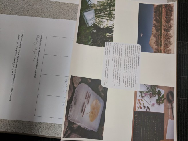
Here is what I came up with, without initial research into XU Bings Forest Project.

IMG_20180108_170754.jpg

Part two was to answer some questions relating to our given case study. This Q&A was to make us aware of how design may influence and engage and audience relating to a particular social issue. Below are the questions and answers.

How they present their message?

XU Bing presented their message in the form of Art produced by children. The message is embedded in the art through visual signifiers such as trees, caligraphy and type.

How they enable an experience?

The Forest Project encourages local children to collaborate ideas in the form of art. This enables experience by encourage children to be creative, whilst also thinking about a social and moral issue of deforestation. It further enables experience by auctioning the art off, allowing the public to experience the children’s creative visions of forests

In what ways they are, or can be interactive?

The forest project enables children to interact with design by allowing them to be creative in their vision of a forest. It asks them to reimagine their perception of a forest, using their creativity to engage in the social issue of deforestation.

What potential there is within them to inspire?

I think inspiration comes from the children’s ability to be creative. The younger generations visions tug on the heart strings of older generations to be aware of the issue. It uses creativity as a medium to inspire younger generations to act responsibly within the community.

In what ways they might start a conversation?

The Forest Project acts as a gateway to start conversations about problems such as deforestation. In relation to the Tragedy of Commons, explored in a previous post, it uses a call to conscience in a soft approach, using children to remind older generations of what they might miss out on.

How they might enable the audience to know (new) things or change perspective?

Many people are consumers of paper products without consciously thinking about it. For example, packaging of products broadly uses paper products derived from trees, whilst toilet roll is used every day and discarded.

In what ways you could adapt anything or be inspired by what you see here to ideas for your own projects?

I think there’s a lot that can be taken as inspiration from this project. So far, I think we’re all guilty of thinking of big, grand prototypes that are all singing, all dancing pieces that take a lot of construction and time, that doesn’t seem feasible in the allotted time. This just shows that an audience can interact with a social issue in an indirect way, educating them whilst also engaging them in fun activities. Although the final pieces may not be as refined as a professional artist, the link between the issue of deforestation and future generations is highlighted with the use of child artists being sold to an older demographic.

Project X – Reading Week Task: Tragedy of the Commons

As part of our research, we were asked to look at the tragedy of commons to understand how climate change is not just an issue that can be solved with one solution or person. The model created by Garrett Hardin, attempts to make everyone understand common ownership. Using an analogy of goat on community fields, it was easy to understand how as more the farmer got greedy and bought 2 goats to graze on the community fields and be more comfortable. As more people caught on to the idea of owning more goats,  the quality of grazing reduced on the community fields, and therefore the price the goat owner got for the goat reduced, so he bought more to be able to live and feed his children. This illustrates the global problem of commons grounds that we use, and how we get greedy and overuse common ground for personal gain. This is evident in cases such as:

  • Farming and Cows
  • Over fishing
  • Littering and dumping


Types of solutions


Otherwise known as guilt tripping. This idea appeals to the intended audience in a verbal or visual manner, but leaves the decision making up to the audience, making the model flawed as other people vested interests in taking advantage for personal gain. This section showed an advertisement of an an Indian walking into the modern world, seeing how man has destroyed the natural habitat. This was a clear attempt from the government to try and change public perception and be more aware of the damage we are doing to the world. Using the native Indian as a symbol of what the world used to be like, the advertisement pleas with the audience in order to change how they think. However, this model is less effective than other model, as it asks the audience to make up their own mind.

This technique is used to try and deter people from polluting the earth in the first place, by putting sanctions such as:

  • Taxes
  • Regulations
  • Laws
  • Dictatorship

This is arguably one of the best models occurs democratically  what Hardin calls mutual coercion mutually agreed upon.