Effective web design is not determined by the website owner, but by it’s audience, like the phrase ‘beauty is in the eye of the beholder’. There are many factors that make a good website, and not only aesthetic decisions are made, but the usability and functionality of the site is a key aspect in web design.
PURPOSE
What is the purpose of the website? A web designer must identify what the purpose of the site is, and what the audience might look for when visiting the site. For example, are they looking for information, entertainment, or even e commerce. Each page should have a clear purpose, and fulfill a specific need for the websites users in the most effective way possible.
COMMUNICATION
The audience judges the design very quickly, so it’s important to capture their attention early and make a good impression. The best way to do this is to make sure everything is bold and clear, with minimal information. Organising information for the user to easily digest is a key element to good digital design. Ways toe achieve this are using headlines and sub headlines, using bullet points instead of block texts, and being concise and to the point when it is necessary to use text.
TYPEFACES
Sans serif typefaces are contemporary looking fonts without decorative finishes. They are easy to read on screen, which is what the audience needs. The ideal font size for reading easily online is 16px. Sticking to 3 typefaces in a maximum of 3 point sizes will keep the design balanced.
COLOUR
Complimentary colours create harmony in the design. Using contrasting colours for the text and background will ensure that the design is clear and easily read by the user. White space or negative space can also be good tool to make the design look modern and uncluttered.
IMAGES
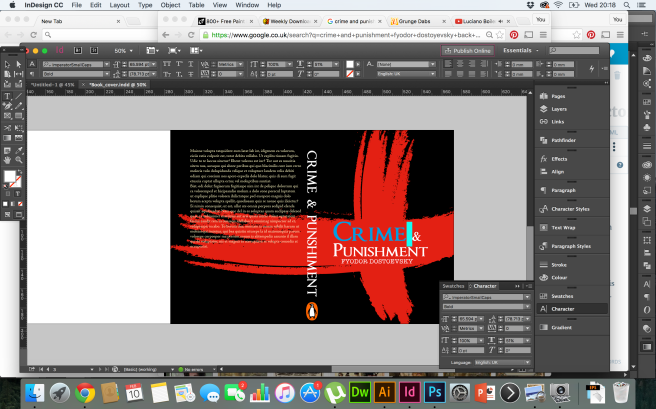
An image can do all the talking. Choosing effective imagery can go a long way to communicating with the audience and also helps with brand positioning. Infographics, graphics, illustrations and videos are also effective ways of communicating and interacting with the audience, a much more personal and engaging approach compared to block text.
NAVIGATION
It’s important that the user can easily navigate through the website. Some techniques for effective navigation include logical page hierachy, and using the ‘three click rule’ where a user must not have to click more than three times to get to the desired information. The user will get restless and bored past this point.
GRID BASED LAYOUTS
Grid based layouts give structure to a design. If elements are floating around the webpage, the design will have a haphazard appearance that looks messy and unappealing to the eye. Grid layouts align content into sections, columns and boxes. This gives a design a more contemporary and balanced feel.
“F” PATTERN DESIGN
Studies show that people scan computer screens in an “F” pattern. This is the way we read books, from left to right, so it’s most natural for the eye to follow in the fashion. A well design website will take this into consideration, with a hierarchy of importance from left to right and top to bottom.
MOBILE FRIENDLY
In this day and age, everyone has a mobile device, so it’s important a website can optimise to different screens so the user can view the webpage on one page. This reduces annoyance and means the website is accessible to an even wider audience.


 Ed Clark Design