Black & White Photography Research – Henri Cartier-Bresson

As part of my research, I wanted to look at some well known black and white photographers to see how they use the contrast and texture to create mood and atmosphere in their photography.

“For me the camera is a sketch book, an instrument of intuition and spontaneity, the master of the instant which, in visual terms, questions and decides simultaneously. In order to give a “meaning” to the world, one has to feel involved in what one frames through the viewfinder. This attitude requires concentration, discipline of mind, sensitivity, and a sense of geometry. It is by economy of means that one arrives at simplicity of expression.”

http://www.henricartierbresson.org/en/hcb/

The work of Henri Cartier-Bresson is a massive part of the makeup of contemporary photography. He help shaped the modern form of photojournalism. He had an extraordinary talent for judging “the decisive moment” served to blur the boundary between an artist and a journalist, whilst working predominantly in black and white and producing countless iconic images.

I love how this shot is framed. the audience can see the urban landscape, with focus to the bottom right on a spiral stairwell leading to the ground. The photographer is positioned at the top of the stair well, capturing a cyclist in the top right speeding through the streets. Again the cyclist is positioned perfectly in a small space in the frame between the buildings and the railings of the stairwell. There is a small amount of motion blur, which would strongly suggest the photographer has used a slightly longer exposure time instead of “freezing time”. The contrast of black and white has a very “moody” feel to it, and provides strong contrast between the subject and the rest of the scene.

henri_cartier_bresson_bicycle

This portrait shot also provides an exciting contrast between black and white. There are two figures that stand out in the shot, however they have been “blacked out” to just be sillhouttes. The water offers the contrast between the black buildings and figures, with light from the sky reflecting from above. I love how the reflection is used to create mood, with exciting visuals. The person running across the ladder is captured and the perfect moment, just as the persons shoe is about to touch the water. The audience can see the path the person has tavelled from the ripple of the ladder in the water, though the rest of the frame is frozen still. There is a small amount of blur on the man that is running, which again tells the audience he is running and they may ask themselves, why? Henri Cartier-Bresson has merged art with journalism, setting the scene yet creating mood and visually stimulating images.

henri-cartier-bresson-gare

There is one sole figure in this image with his head resting against the desk. This tells the audience that he is either tired, or depressed. I think the fact he is sitting by himself, with his hat positioned next to him tells the reader he is unhappy. This works well with the atmospheric contrast between black and white. If colour was present, I think it would detract from the feeling of the frame. Black, white and grey have “dull” connotations, which could be a sign of what the mans life is like.

henri-cartier-bresson-brooklyn-new-york-1947


Conclusion

From this research I think I have learnt how black and white photography can influence the feeling and mood of the photograph. Some of the techniques I want to use from this research are as follows:

  • Motion Blur
  • Water Reflection
  • Silhouettes
  • Framing

Framing My Shots

Before taking the camera out, I just want to look further how framing my shots can have different effects to the audience.

Framing is a technique used by photographers to draw attention to a subject by blocking other parts of an image.

The Benefits 

  • Giving the image context
  • Giving images a sense of depth with layers
  • Leading the eye towards your main focal point
  • Exciting the audience

Frames come in all shapes and sizes, and can include shooting through branches, tunnels & windows or even people. The question the photographer must ask them self is ‘will this add to or take away from the image’. If it adds, then consider leaving the frame. However if it subtracts from the image, then frame your shot differently.

Also consider whether the frame should be in focus or not. In some cases, a nice blurred frame will add depth and mood to the shots. So consider the aperture value to manipulate the depth of field.

Black and White Photography Research

I wanted to look at black & white photography in more depth to distinguish key components that I can take and use in my own work.

The image below shows a close up of a Lion. The framing draws the audiences eye to the cats eyes, and the gaze engages the reader. The image is sharp and in focus, with ever hair giving texture and clarity. I love the contrast between black and white, which adds interest to the design.
 

1-lion-black-and-white-photography-preview

This image has an “infrared” effect, as if it was shot at night. This is something to consider with my design, as I plan to use an infrared effect to imply the image was shot at night.

black-white-animal

I like how direct the position of the cat is. The focus again is on the eyes, drawing the reader into the cats gaze and engaging them further. The black background gives good contrast to the black and white cat. The image has been taken with a low f-stop value, as you can see the shallow depth of field as the cats body leads off into the distance.

bnw-10

Magazine Grid Layouts – Research

To strengthen my knowledge of layouts, I wanted to refresh my memory and delve deeper into grid layouts, and how a hierarchy importance of an article can me maximised using grids.

Golden Section

A relationship between two numbers that has been used in Western art and architecture for more than 2000 years.

The formula for the golden section is a : b = b : (a+b).

screenshot-2017-01-10-11-06-46

This means that the smaller of two elements (such as the shorter side of a rectangle) relates to the larger element in the same way that the larger element relates to the two parts combined. In other words, side a is to side b as side b is to the sum of both sides. Expressed numerically, the ratio for the golden section is 1 : 1.618.

It is supposed to be the most natural spot to place an image, as the readers eye sits most naturally on this point.

Single Column Grids

Screenshot 2017-01-10 11.15.32.pngThis is the most simplest for of grid design. I consists of a single column of text contained by margins. This is quite unappealing and is rarely used in design

Multi Column Grids

This provides flexibility whilst also keeping a strong backbone to the design. It helps to divide the hierarchy of articles by balancing text and imagery. It creates zones in which content can sit comfortably in, and overall more aesthetically pleasing.

screenshot-2017-01-10-11-15-43


Black & White Photography

Black and white photography has a sense of nostalgia to it. It reminds us of what photography used to be like, and how far it has become.

I think this message is perfect for my book, as it adds a mythical element to the subject, whilst also achieving strong dynamic contrast.

Before taking my shots, I want to think about the following to achieve a successful outcome:

  • Focus on contrast
  • Focus on texture
  • Use photo filters
  • Try long exposure


Clipping Paths, Layer Masks & Image Tracing – Photoshop/ Illustrator

After gathering my images and looking back at my sketched designs, I set about isolating the cat from the background to use on white paper. My book is black and white, so I will alter the saturation and colour channels. However, my initial task was to create the path around the cat to maintain the detail of the cat but isolate it from the background. This would be really easy if it were on a plain background, However the busy background will make it tricky.

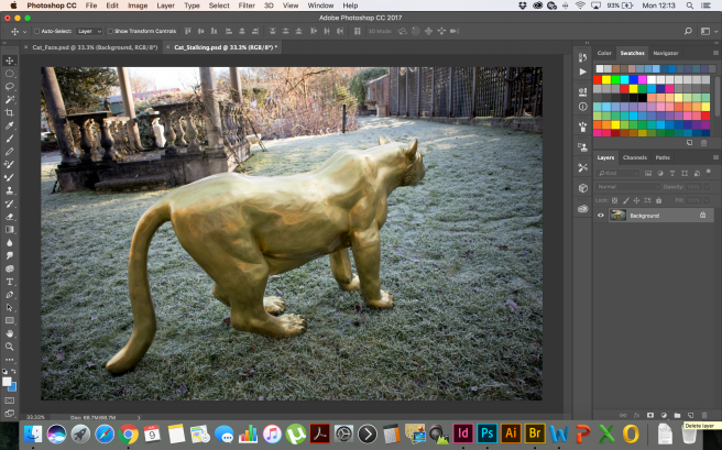
So below is the image of the statue of the cat that I wanted to clip. I started by using the magic wand tool to make a rough selection around the cat.

screenshot-2017-01-09-12-13-02screenshot-2017-01-09-12-14-23


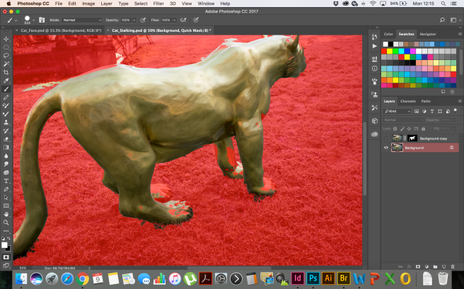
I then hit “Q” on the keyboard to get a quick selection mask. This enabled be to tidy up any parts I had missed. This is almost like another layer of refinement of the overall selection.

Screenshot 2017-01-09 12.15.08.png

I then hit “Q” again to exit the selection mask. giving me a decent selection but not as tight to the body as I’d like. I went to select and mask to refine the edge and maintain the detail within the cat. I manipulated the sliders to get a pretty tight selection. I used a variety of different backgrounds to make sure the selection was clean

screenshot-2017-01-09-12-17-46screenshot-2017-01-09-12-17-44screenshot-2017-01-09-12-17-14

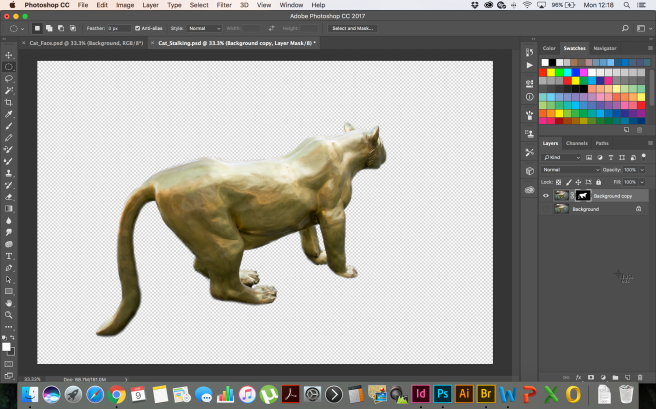
In output settings, I hit new layer with layer mask. This enabled me to tweak edges with a very soft brush, just by painting in black and white on the layer mask. Below is the outcome of all the refinement.

screenshot-2017-01-09-12-18-19

I then saved as a .psd to maintain the layer structure and transparency of the clipped artwork. I then imported it into illustrator, where I imaged traced the image. The brief said we can be as arty as we like, and I feel this arty vibe gives it a touch of fantasy, whilst combining the book with “genuine” images of cats seen in the wild.

I took this process with two images I had taken of the cat

The Outcome – (Layout to be tweaked)

screenshot-2017-01-09-12-40-26

screenshot-2017-01-09-12-42-56


Sourced Images – Conspiracy Theories

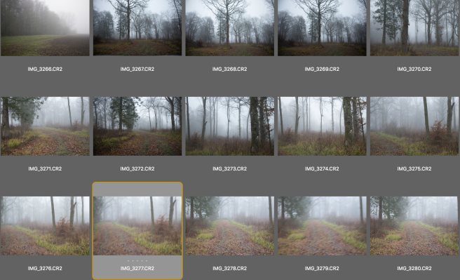
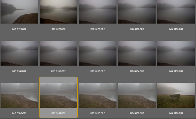
After conducting my extensive research into photography and gathering all my inspiration. I took my new camera out around surrounding countryside hotspots in Kent & Sussex. One of the most interesting outings was to Bewl Water Reservoir over the holiday period. It was freezing cold and darkness was about to descend, perfect for a spooky misty scene.

Screenshot 2017-01-09 11.04.32.pngscreenshot-2017-01-09-11-06-11screenshot-2017-01-09-11-05-57screenshot-2017-01-09-11-05-47screenshot-2017-01-09-11-05-33screenshot-2017-01-09-11-05-16screenshot-2017-01-09-11-05-05screenshot-2017-01-09-11-04-50

I took all the shots in camera raw as opposed to jpeg to make sure all the tonal data is maintained and not compressed like a jpeg would. This will enable me to further manipulate the colours in the post production process.

I also played around with the exposure time, attempting to create motion blur from a low shutter speed.

I also managed to locate a fantastic bronze statue that will be great for my final piece. I went over to Chilstone in Fordcombe, Tunbridge Wells. I took multiple images various angles to make sure I had loads to chose from in post production. I made sure if anything, I underexposed as opposed to over exposing the subject. I did this because it’s easier to get detail back from the shadows, rather than reducing the highlights and overexposed areas.

screenshot-2017-01-09-11-14-45screenshot-2017-01-09-11-14-30

Inspiration – Conspiracy Theories

Before setting off with the camera and planning my photography, I wanted to look at the style of photography that I’m looking to imitate, understanding the emotions and messages the audience is receiving. I’m going to look at a series of images of wild cats in the uk, analysing what elements work well and what I can take from this research to implement in my photography.


p02n9wm8

I find this image quite striking. There is a lot of motion blur, implying the animal is fast. Although the background is so blurred, you can tell the animal is in a natural environment. The cat blends in with the colours of the background, making him blend in and seem less obvious. The animal looks as if it’s hunting and running towards its pray. Interestingly, the animal is framed in the lower left part of the image, spreading across almost two thirds of the horizontal width. I found it interesting that the legs appear to be cut off in the frame, however, I think this has be done purposefully, to show how difficult it is to get a glimpse of the animal, and injecting fear.

images

This cat has been shot from a long distance and this can be seen in the grain of the image. This tells the audience that the animal is wild and the photographer took care not to approach the cat. The dark cat is almost a black silhouette in against the dark shadow behind. However, The audience can distinguish the shape of the cat from its pointy ears and feline figure.

3483838233

Again, the image above has been shot from a long way, and the image is of very poor quality. Although the photographer is providing evidence to back up the claim of wild cats in the UK, he has also added doubt in the audiences mind due to a poor quality image. The dark cat again can be identified by its long tail and stance from prior knowledge of cats.

728872-big-cats-mystery

Although this may seem comical, the idea of using a statue may actually be quite effective in my own project as it’s pretty unrealistic to find a wild cat in the UK in such a short time. I may use a single shot like this, or, I may isolate the cat statue and create a composite of different images.

What I can take from this research?

  • Motion Blur
  • Using cat statue
  • Image quality? Blur?
  • Cat silhouette
  • Framing of the shot – Where & Why?


Composite Image Editing & Colour Adjustment – Design Process

I took advantage of the gloomy, merky weather and visited the local resevior to gather images for my conspiracy of big cats in the wild. The vast open natural landscape made it a perfect scene in which to generate ideas. The mist was starting to become dense very quickly as darkness descended, so I hoped to get some interesting shots.

Why Black and White?

Designers commonly shoot in black and white today as it offers timless quality to the images. This is because we still remember the origins of photography, a throwback to the photographic past. In this instance, I think it adds an air of spookyness, whilst also enrapturing the mythical aspect. This “timeless” quality of black and white photograph, I think, lends itself to this particular image and perhaps a large portion of the book.

One of the best was this image. I think it really encaptures the spooky feeling im trying to get accross.

Screenshot 2017-01-04 11.49.19.png

Although the image is dark, I want to change the colouring to gain an infrared effect. This will make the image look as if it has been shot at night, and has “accidently” been captured.

I first created a new adjustment layer to black and white, moving the different colour channels to get the best black and white possible.

Screenshot 2017-01-04 11.56.35.png

I created a new layer and lightened the whole sky, as i think the small vignetting is slightly distracting from the image.

Screenshot 2017-01-04 11.58.32.png

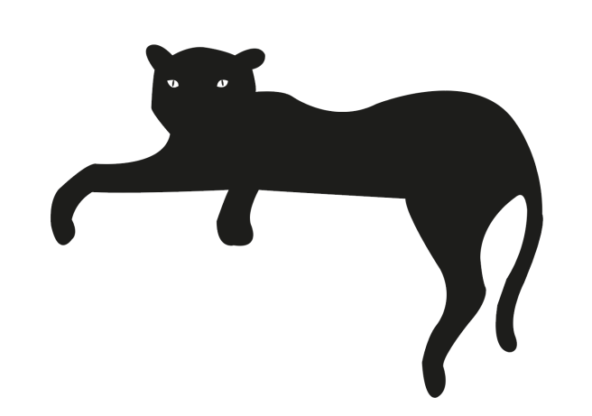
I then used my illiustrator skills to create  the shape of the cat that I will blend into the landscape.

Screenshot 2017-01-04 11.59.32.png

I copied and pasted the vector and a smart object into photoshop, adjusting the scale of the cat and skewing the shape slightly to sit nicely accross the grass verge on the right of the image. I changed the blending mode and opacity to fit in with the “infared” effect.

Screenshot 2017-01-04 12.03.13.png

Although this is quite mysterious, I think its almost too obvious and the audience don’t have to search very far to find out what the animal is, so would be rejected quickly. To make sure the audience is really spooked and engaged, I added a motion blur to imply speed and also makes it harder to identify the  animal. Screenshot 2017-01-04 12.06.42.png

Just to add another sign for the audience to make them believe the image is genuine, I added a reflection in the water of the cat by flipping the shape and reducing the opacity in the water.

Screenshot 2017-01-04 12.10.57.png