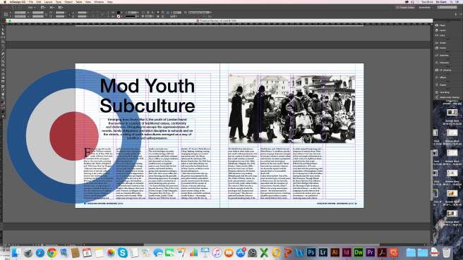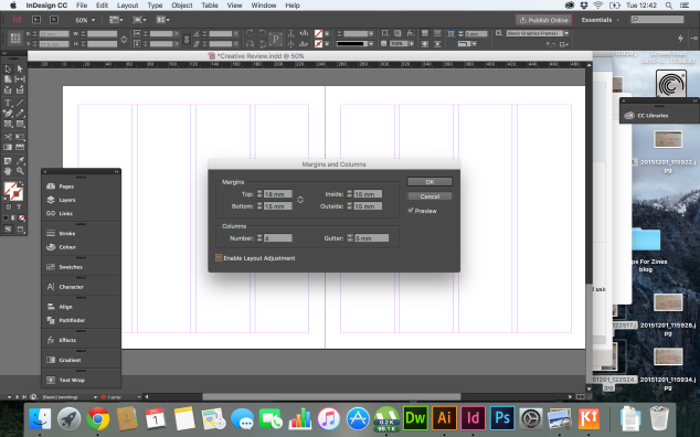
I tried a variation of different layouts and images to see which would best suit the ideologies of my chosen subculture, also paying close attention to the resolution of the images, so when I come to print, they won’t come out pixelated or fuzzy.
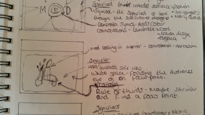
I started by trying the rule of thirds approach, with an image spread over the two pages. Although eye catching with the contrast in colours, I don’t feel the image screams vespa or Lambretta, or even mods in general. I tried to add repetition in the form of two circular shapes, one showing the Lambretta logo, and the other with an image of Mary Quant, signifying the style of the 60s that mods would relate to.

I tried the same design but with a different image. I found it challenging to source a high resolution image from the internet that represented the ideologies of my subculture.

My final design I think works well and feels very balanced. The image i’ve used on the right page is an icon of the youth subculture as it has a physical resemblance to the signified. I also used the Lambretta logo bleeding off the left of the page. I did this so add some sort of depth, as if the design is live and flowing through the magazine. I also liked the use of hairlines throughout the design, and how the heading and introductory paragraph are centre aligned at the beginning of the page. This shows a clear segregation from the body text, but keeps balance with the weight of the image on the right hand side of the page.