FMP Research – Joe Wicks Lean in 15

Joe Wicks is a fitness coach, TV presenter and author, with a passion for fitness and cooking. His first published cookbook Lean in 15 sold 900,000 copies and was a best selling book in 2015. He also presents his own show on Chanel 4 called The Body Coach.


I think this is a good starting point in my general research of the market. It just so happened my Mum bought a copy, so i’ll be trying the recipes in the next few weeks for further research. I like how simple the cover is. The subject is Joe, and positioned to the right, with text on the left. At first glance, you see what the book is about, “Lean in 15” clear and bold. The subtext is smaller in size, and in a less striking colour in yellow on white. It does seem to be directed at the female market, and this can be seen in the use of colour combinations and layout.

I noticed the title and his name were embossed & with a spot uv, adding interest and a nice feel when handled. This printing technique might be something to consider in my design. However on the down side.. I don’t really like the layout or the colour scheme of red, yellow & blue. It almost feels like a school exercise book.. However as the book moves onto recipes, the design becomes more exciting and visually more appealing.

wp-1487849805143.jpg

I instantly recognised the typefaces used in the contents page, “Gotham” which feels very clean and neutral, but “classy” too. I feel like it lacks dynamic visual appeal though in the layout, and especially as it’s a fusion of cooking and sport.

wp-1487849803216.jpg

As we move on to the recipe pages, the photography becomes more of an art form, with directional soft natural light coming over the subject at an angle. The image focuses on the drink as the main subject, with the fresh ingredients of the drink scatter in the foreground and background in soft focus.

wp-1487849803215.jpg

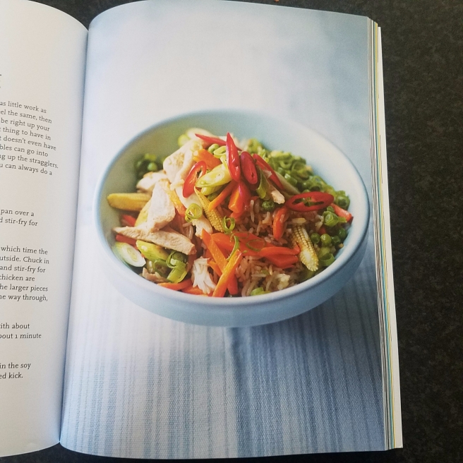
I like the simplicity of this shot. The light comes from a similar angle to the smoothie image about, however a new textured cloth has been used. The printing is so detailed it picks up every stitch, and adds interest to the food it sits on. The soft blue tones add an inviting and homely feel, encouraging people to try the recipes for themselves.

wp-1487849804451.jpg

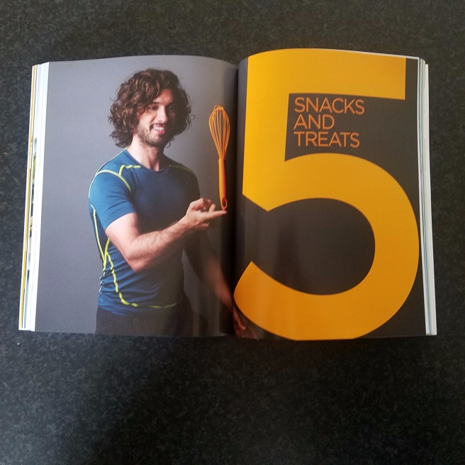
I really like the section dividers. This is the type of design that I was hoping for in the contents pages as a sports fitness diet plan. The colours are vibrant, and the subject is positioned either side of the. Small props are used to reinforce and anchor the title of the section, and colours are linked too.

wp-1487849803225.jpgwp-1487849803231.jpgwp-1487849804416.jpgwp-1487849804449.jpgwp-1487849804512.jpgwp-1487849803219.jpgwp-1487849804421.jpg

Evaluation

There is defiantly a lot of information in this book, and lots of interesting material to learn and use in my own balanced diet book. I’ve identified elements I dislike about the design, and what I would have wanted to see as a consumer. However, the photography was simple yes effective with good use of lighting and contrast. I will continue to analyse sources to gather more knowledge and information to strengthen my design.

Fear & Love – The Design Museum

As a class, we took a trip to the new Design Museum in Kensington. After being named one of the winners of the Design Factory competition last year, It was always going to be an interesting experience the new space and ever exciting exhibitions.

The exhibition explores a spectrum of issues that define our time on earth, including: networked sexuality, sentient robots, slow fashion and settled nomads.

Staples:

This was one of my favourite pieces on display in the exhibitions designed by Kenya Hara, a Japanese graphic designer and curator. She produced a graphic display of staple foods from around the world. Although this could be construed as “simple”, the message is clear. The idea of staple food is that its quick and easy to cook, whilst providing vital nutrition to survive. The images are shot from directly above the food, whist the light comes from above at a slight angle to produce shadow. This gives a very realistic & 3D feel, as if you could reach out and touch it.

wp-1487846298542.jpgwp-1487846190507.jpgwp-1487846183948.jpg


Madeline Gannon presents Mimus:

The designer looks at how robots and artificial intelligence can design a robots emotions. the robotic arm shows interest and curiosity at subjects around the enclosure. It feels as if the designer has thought about the issue of artificial intelligence, and the danger it may have to our society, as Stephen Hawkin has warned us previously. The enclosure symbolizes the advancement in technology is constrained by fear.

606_980-86e7c0f6-d614-496e-8605-2c7b1b8dc401

Christien Meindertsma

Christien Meindertsma chose to explore how textiles could be better recycled in the future. She took 1000 discarded jumpers and recycled the the fibres. She found that not all jumpers are what they say on the label, which was a major discovery in the industry. Here exhibition was a composition of rainbow-hued piles of wool, with a sample and image of each jumper and fibre.

wp-1487846196632.jpg

FMP Proposal

We were given an “open brief”, which gives us the opportunity to showcase what we’ve learnt this year, and be creative with our own interests. My strengths lie in food photography, and feel like I have a wide knowledge of products and experience in digital food layout design for a well known national food wholesaler/distributor.

I began to think about how I might display my skills as a piece of design, identifying “problems” or gaps in the market in which I could be creative. I listed some ideas and chose the one most interesting and appropriate for the brief.

My proposal:

Who are we talking to?

Adults aged between 18-60 interested in improving their health.

Message

The book is to be produced for the sale in book stores and major retailers around the world.

What is the USP?

The market is saturated with “healthy cook books” but how does the consumer know what a balanced diet is? Current healthy cook books and diet plans just tell you what to eat with out educating the consumer on what a balanced diet consists of.

How do we want to come across?

The tone of voice should be soft and inviting, but with powerful photography to entice the consumer.

What is already in the market?

There are loads of different healthy cook books out there, but none educate the consumer on what a balance diet consists of.

What are the deliverables?

Possibly a multiple page book/ or equivalent digital mock ups.

G.F Smith

It was great to have G.F Smith come in as a guest speaker to talk about all things paper! It’s a fundamental part of design, and something I have great interest in.

They handed us loads of different samples explaining how and why they were designed as sheets, and what reaction each material has with ink. They also supplied small printed books which illustrated different printing techniques and finishes, with a key on each page telling you exactly what has been used in the makeup of the design.

One of the most interesting sheets of paper he spoke about in my opinion, was “heaven 42”, a ultra white sheet of paper. To demonstrate, the paper consultant held up a standard sheet of a4 plain paper. The difference was quite dramatic. The consultant outlined the history, mentioning it was originally produced for a well known luxury car brand. They wanted a white sheet that had a very slight tint of blue. They thought that this would make metallic and shiny images to pop right out of the page. I have to agree, the printed results were incredible! The carmaker however didn’t retain the license for long, so the printed advantage wasn’t for very long as other producers began to print their catalogues on Heaven 42.

I also learnt the difference between coated and uncoated papers, and how the ink reacts to different fibres and weights of paper. G.F Smith are the luxury end of the market, and a lot of their sheets are very adaptable in terms of the printer used. However it was still great to hear local knowledge of printers around, and having dialogue about what type of printer will deliver the best results, for example digital vs litho.

Final Designs & Evaluation

After completing the project and presenting my work to classmates and tutors, I wanted to take the opportunity to reflect on my work.

I think I effectively explored different styles of both photography and style, and enhanced my knowledge of both as a result. I considered my role as the photographer and adapted the brief to work to my strengths as a photographer and a graphic designer. I produced two double page spreads using 3 images.

Although my tutors disagreed, I think I could have nudged the point size down a fraction to make it slightly less clunky on the page. I also noticed a typo on the page, which I will change for my portfolio, but disappointed I lacked that essential attention to detail required. I want to try and stay on top of my body text and make sure everything is at its optimal best.

Big Cats_final3.jpgScreenshot 2017-02-02 18.50.19.png

Good Design Evaluation – Conspiracy Theories

To stay conscious about my role as a designer, and what implications I may have on the world as a result of my work, I want to evaluate my project and set targets to decrease my impact on future ones.

  • In what ways have you considered the sustainability of your project process and outcomes?

The brief that was set asked us to create a small souvenir book to be sold in the shop of an exhibition about conspiracy theories. The raw materials used in the making of the book would be paper & ink. Although there is a lot of deforestation happening in areas that shouldn’t be harvested, the majority of the wood used is planted and harvested as a crop. There are in fact x50 as many trees as 100 years ago. I didn’t use recycled paper as this is arguably “less green” as there is considerably more energy & water used to collect and treat the paper. I think it would have been quite easy to print and reproduce with little impact on the environment, as black and white printing is cheap and cost effective.

  • In what ways have you considered the ethical implications of your project process and outcomes?

I designed a “fake story” to generate fear amongst the public. Ethically, I don’t think it’s right to make a story for the purpose of scaremongering.


  • In sustainable and ethical terms in what way was your work in this project an improvement or a backward step for you as a socially conscious designer?

I think I could maybe have done more research into how I could use less paper, perhaps making the book as one folded sheet. However I don’t think this piece would a massive impact in the future.


  • What targets can you make at this point for your work in the future as a socially conscious designer?

In future projects, I want to have a clear vision of what the end result will be. This will help me choose materials earlier in the process and adapt for a more sustainable end product. I also think I need to conduct more research into sustainable materials to be used in print design, to reduce my overall impact on the world.