FMP – Existing Shoe Companies Research

To further understand my audience, I wanted to look at what other established shoe brands are doing to target their specific audiences. This will give me an insight into what other brands are doing well and not so well, and attempt to design a better platform for the end consumer.

Nike App

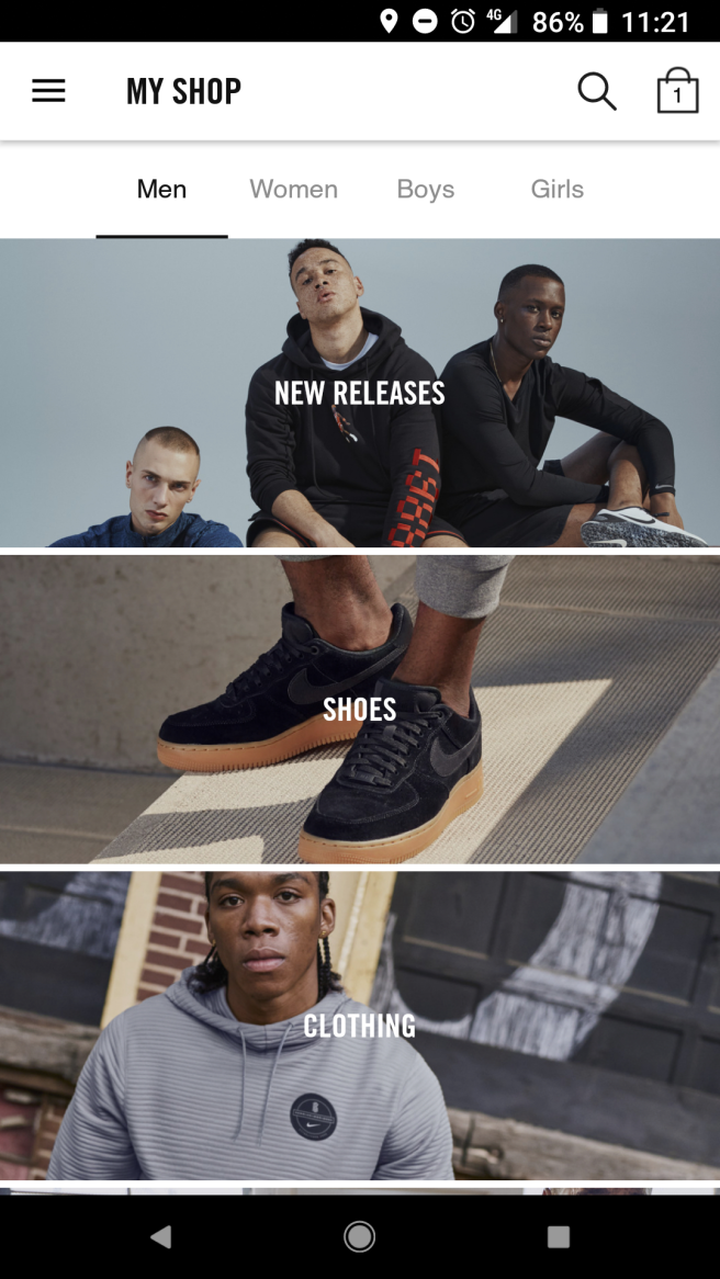
Although the app is incredibly easy to navigate, it feels very sterile, not very exciting, and too clinical. These ideologies represent the Nike brand well, showing speed and efficiency.

The imagery used is very “cool”, showing you males in provocative, moody poses, highlight the shoes, but providing the audience with an aspirational image that, by association, makes the brand “cool” and youthful.
Screenshot_20180529-112137

The user can easily navigate through the app, finding product ins specific categories. These categories funnel the user down, to show them products they really want to be seeing.
Screenshot_20180529-112144

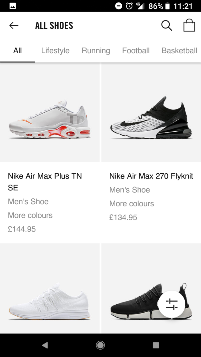
Again, the product detail page is very stripped back, simplistic, but serves a purpose and ties in well with the brand. The navigation is consistent throughout the design, making it easy for the user to navigate through the app. The price of the product is always visible at the bottom of the screen, making it easy for the consumer to purchase the product at any point of the during scroll.

Screenshot_20180529-112153

Nike Running Club App

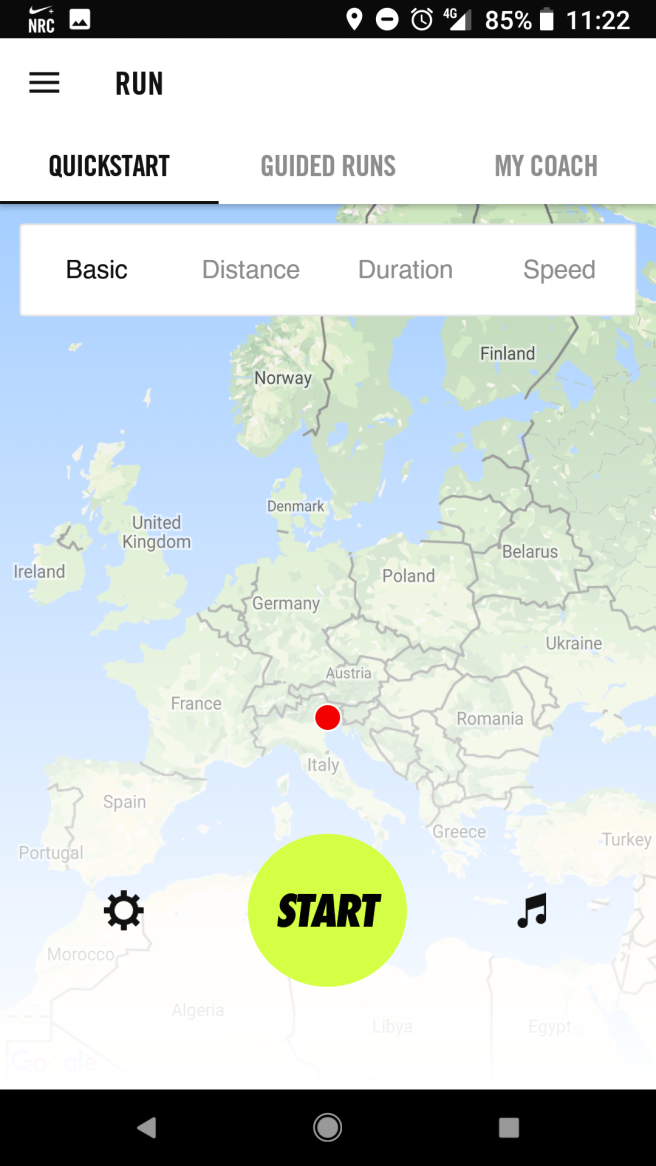
Like many apps I’ve looked at, intro screens usually help the user understand the conventions of the app. It shows the user how to use the app, whilst also setting up an account to store personal preference data, such as specific interests, show size, location services etc. This information is then stored, and can be used to push specific products to consumers based on their personal interests.

Screenshot_20180529-112227Screenshot_20180529-112238Screenshot_20180529-112252

Adidas

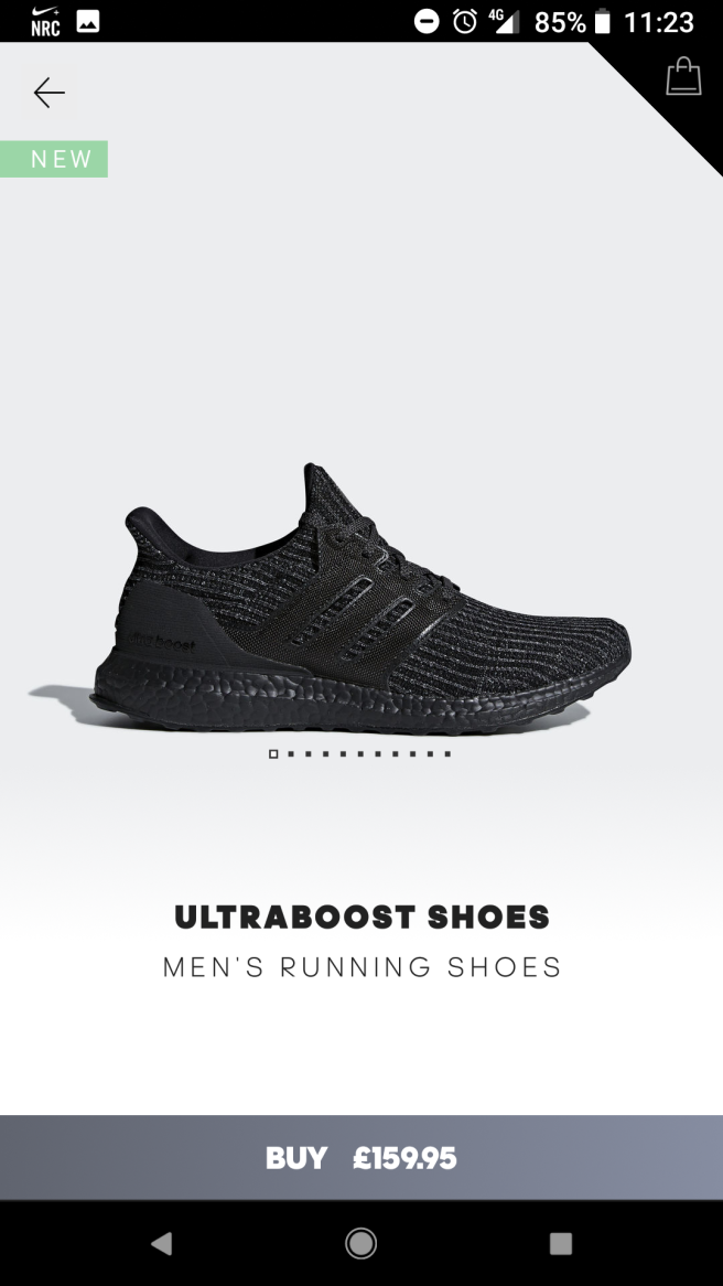
A more stylised approach, giving a bespoke, designed feel to the app and brand. To the consumer, this gives a sense a personalisation, something the consumer craves. The sharp diagonal lines encourage the notion of speed, something performance sports brands seem to have in common.

Screenshot_20180529-112312

I like how many of the apps use a very neutral colour, such as whites, greys, and blacks, that draw focus to the shoe its self. Other colours could distract the consumer from the main focal point, and this could translate into a mis sale.
Screenshot_20180529-112323

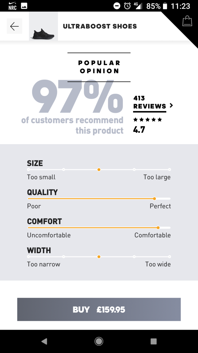
Infographics and reviews provide the consumer with previous customer experiences with the product, providing justification and reassurance about to the consumer.

The consumer can choose from the following categories to score out of 5 on the scale:

  • Size
  • Quality
  • Width
  • Comfort

Overlapping elements provide a further stylised feel, reducing the opacity to draw importance to the darker text.
Screenshot_20180529-112332


Reflections

This process has been really useful to see what’s already been done. Recently, I watch a TED talk about the development of ideas. Many ideas are usually solid, for example, the concept behind MySpace, Bebo, was actually a great idea. Social media boomed around this time, but facebook didn’t jump straight into the social media market. They saw what Myspace and Bebo were doing, and looked to improve on the platform to try and appeal to the mass audience. The UX of MySpace wasn’t the best. If you understood MySpace, you were considered a social media genius. Facebook developed their platform, changing an idea that had already been invented. Today, Facebook is the largest social media platform that has continued to innovate and grow as an organisation.

My point is, their are sure to be a huge amount of shoe apps out their doing a similar thing, but how can this be improved upon. What can I do differently to the my other competitors that will make me stand out. These questions are to be considered in the early stages of the design process.

FMP – Mood Board – Branding

Creating brand identity is something that I have quite a lot of experience in, however, I wouldn’t necessarily say I’ve enjoyed it in the past. I think this is because I get frustrated when the creativity dries up and the ideas generation slows down. This is mainly due to the fact I don’t spend enough time looking for inspiration, finding things I like and don’t like, and questioning why I chose the features that I did. This developmental process is key to opening new possibilities I may not have considered previously. Conducting research on my target audience gives me the ability to target there interest, and this should be reflected in the targeted inspiration.

Below is a link to a mood board I made to keep all my ideas in one place, where I could easily refer back to them at any time.

https://projects.invisionapp.com/boards/V43N71WNPW5/

FMP – New Software Skills: Adobe After Effects

I, like everyone else, love animation. It can bring a still, flat design into a exciting, dynamic piece, engaging the audience through motion. I’ve been fascinated with Adobe After Effects, watching tutorials online and trying to understand how to get the best out of it to animate my screens. I’ve worked on a small animations at work but found it really difficult to get my head around it sometimes, which made me put off touching it for my FMP initially.

One day at work, I sparked an idea that I wanted a fingerprint for a fingerprint recognition screen in an app I was designing. I sat down with my mentor, who took me through step by step how I can animate a mask from point A to point B in time. The repetitive process of animating each individual stroke of the fingerprint was like a lightbulb moment. I suddenly grasped the concept of animation.

That weekend, I took what I had already in terms of screens in Sketch, and exported each element of the screen that I wanted to animate, and the background plain.

Wordpress_New_software.gif

Using different comps to group screens together and transition between screens, I was able to remain organised.

Animation_01_start_6.gifInsta_upload_animation.gif


FMP – New Software Skills: Sketchapp

The reason I originally chose to design an app for my final major piece, was to explore a new discipline that’s boomed in recent years. Apps are a great way to target audiences with the revolution of smart phones. Everyone has access to app that all provide a service to the consumer.

With starting a new job in web-design, the company have also been looking to venture into the apps market, designing bespoke apps that can be easily changed to represent a brand. I’ve talked for weeks in preparation with my mentors at both work and college, and decided to use Sketchapp to design screens for my app. I’ve watch loads of tutorials online to understand the advantages of using Sketchapp Vs Photoshop.

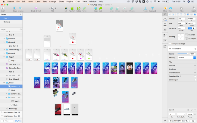
One thing that bugs me about photoshop is the inability to make changes to a style globally. For example, if I had a purple button style but wanted to change the colour, I’d have to make the change on every single layer. Sketch encourages the use of symbols, that give the user the ability to quickly change button styles globally, thus speeding up workflow, which is paramount for this project as I’ve taken on quite a lot of work.

Although my initial sketches show a rough user journey, this journey changed dramatically whilst designing in sketch. Once I could see the refined design in front of me, I could see where I could change it to make it more dynamic and engaging for the end user.

I’m not going to say Sketch has been easy to learn, but I’ve been persistent and fallen asleep watching the tutorials every night to get the best out of it. The other feature that’s come in hand is the ability to export individual elements as well as artboards, at whatever size and file type I want. by choosing “1x” or “2x” I can choose the resolution, whether Im designing for a retina display or not, that has two times the pixels.

Screenshot 2018-05-15 10.55.00.png

Lightmaker Bomb Project: Final Design

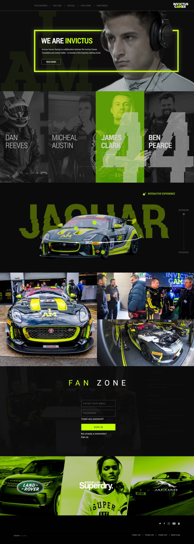
I created the site with fullpage.js in mind, something that i’d been shown at work and have identified in other sites. I think it could be a good way to compartmentalise each section and create a hierarchy of information. I wanted the user to have the flexibility of scrolling, or choosing the specific section from the sticky navigation at the top of the page.

The user is first met by an aspirational image of a driver, with a small amount of text introducing the brand and what they are all about. There is a small call to action below the text inviting the user to read more about the story. They’re also able to click the logo to reveal the about drop down.

I felt it was important to tell the stories of each driver, but I wanted the user to be able to choose which driver they want to scrutinise and find out more information. Invictus has two teams, so I wanted to distinguish them by adding a slider to toggle between the two teams drivers. As you can see, the number of the team has a distorted effect added to it. This was a design choice to encourage the notion of speed, inspired from the Nike Logo story, and the British GT program I found.

The car has been heavily modified to suit the needs of the rehabilitated drivers, which creates a USP for the brand. This is another thing that separates the Invictus brand from the rest of the teams in the GT Championships. I want the user to be fully immersed in the car, giving them up close and personal experience of the car, highlighting key aspects using buttons that reveal overlays that gives specific detail and more information. The user is again able to toggle between the interior and exterior of the car. Inside the car i’m proposing having a a VR experience, where the user is able to tour the inside of the car with their VR headset, again fully immersing them in the car.

Invictus Racing will be competing all over the country, and be in the public eye a lot. The brand has quite a big social presence, and this could be a good way of generating new content to the site. I designed some overlays to anchor the brand further, again using the “cut” design feature that runs consistently throughout the design.

I wanted to give the fans of the team and sport exclusive access to content that regular users don’t have. The user is asked to signup or register for full access to exclusive content, which is a great data capture tool for the brand, where they could use this information to target users with promotional material.

Finally, sponsors inject a lot of money into the team, and they want to make sure they have a presence of the site, as they are partnered with the brand. I wanted this section to appear tasteful, sophisticated, but continuing with the brands ethos.

Desktop Homepage.jpg

Conclusion

I feel like i’ve learnt a lot this week. Even though in theory we had a week to complete the project, I have other work commitments during the week, so really I only had 3 days to complete the project in its entirety. I was aware of this tight deadline and tried to work efficiently in photoshop from the start, structuring the PSD in a professional manner. I did this so if it was a live project, and another designer needed to work on my PSD, they may be confused if they layers aren’t structured in folders. It also makes my workflow much faster. When you compare this project to the piece I created last year, World of Tanks, the difference is staggering. My eye has been trained to see finer details such a spacing, line height, and the impact of the imagery i’m using. I have made mistakes throughout the design process, but i’ve been able to take a step back and identify them quickly and rectify them. Overall, i’m happy with my final outcome, but i’m most proud of the way I presented. I’ve worked hard with colleagues at work about being confident in my own ability and what I design. If I don’t buy into what i’ve created, then how is the client? I was able to talk with conviction and confidence about my design, not putting myself down, and presenting my ideas in an enthusiastic and energetic way.


SEK Bomb Project – Mood Board

After receiving the brief from the client, I reviewed all the information in the written brief and my own notes from the clients presentation. So key points I jotted down myself were:

  • Professionalism
  • Corporate
  • High Quality
  • Interesting
  • Eye Catching
  • Display Information Clearly
  • White Banner To Stay at Top of Banner

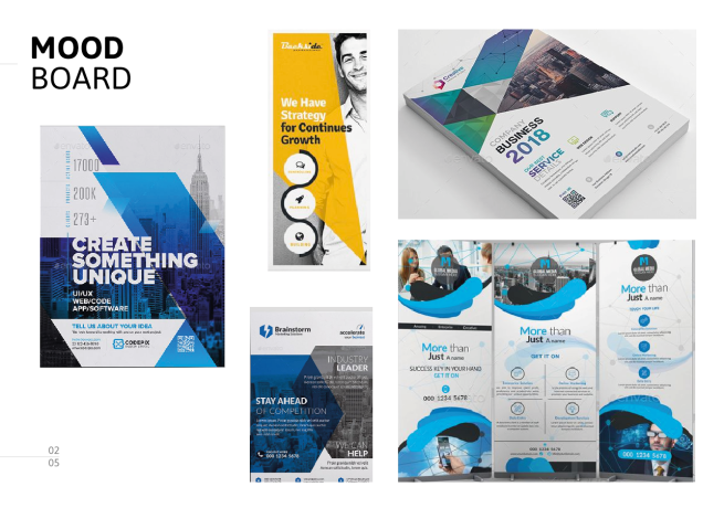
Before jumping into sketches, I took to Pinterest to create a mood board to isolate the tone I wanted my design to convey.Screenshot 2018-03-06 11.02.47.png

This gave me an idea about professional, corporate design. From this initial research, it has sparked loads of ideas that I want to show in my next post about sketches. This will allow me to quickly visualise the design and make adjustments to layout as I seem appropriate.

Project X – The Issue

One garbage truck of plastic is dumped into our oceans every minute. Thats 8 Millions tons a year! Plastic constitutes 90% of all waste in the ocean. with 46,000 pieces of plastic per square mile. One million seas birds and 100,000 marine mammals are likely to be killed from plastic in our oceans annually. Waste damages eco-systems and enters the food chain. It can take up to 1,000 years for plastic to decompose in the ocean.

32% of the 78 million tons of plastic produced ends up in the worlds oceans each year. This figure is likely to double by 2030 and quadruple by 2050, and by that point, there will be more plastic than fish in the oceans. At the moment, only 14% of global plastic is recycled, and only 2% is reused as packaging. The system as it stands is unsustainable and need to change.

In our group, we discussed this information over and discussed the major topic that stood out. Nobody is recycling effectively. This lead us to think about how we could get people to think about how they discard there rubbish, and in the correct way in order to recycle properly.

Project X – Display Day

Today was the day our display would be showcased to the college in the canteen. Looking at how everybody had presented their information on their chosen topic, I found it interesting how everyone had collaborated and generated different ideas to entice the audience in and engage them in debate. I think it’s important to reflect not only on our own design piece, but everyone elses too, as there were some interesting styles and techniques used that I found interesting, and also felt quite jealous that they were able to execute them so well!

Other Groups

One particular display I think everyone enjoyed was “Say no to recycling”. The group adopted a Andy Warhol pop art style, which didn’t necessarily link to the topic, but did entice the intended audience with bright, vibrant colours and interesting visuals. They created leaflets that were handed out to from the stall, and also created a bin to illustrate the problem. I thought the halftone effect was very eye catching, and married well with the pink and yellow type, and the blue background. The colour palette was well thought out and is something that I will remember and use in future projects!26295306_1920207174962072_385637008904552448_n.jpg

Another display that was quite under appreciated (in my view) was the eco building, showing how plants could cleanse the air in built up cities. The interesting element of the display was the 3D model created by Dan. I know how much time and effort goes into 3D modelling, and it’s by no means easy. I think because it has become expected in modern design, it often gets overlooked and under appreciated. However, I think he did a fantastic job and has a lot of talent! I asked him what software he used, and it was Cinema 4D, a program that I had previously encountered from tutorials on youtube. Its certainly an area I want to explore and feel inspired by his design. The display its self was clear and easy to understand, and I thought it was a nice touch that the feedback was handed out on clouds, which were later tied to the table to further strengthen the purpose of the design.

Our Group

Overall, I think the design was well received. The issue itself has been quite prominent in the media recently, yet I don’t think people understood where and how plastic waste ends up in the ocean. People were shocked with the amount of time it took for a nappy to biodegrade in the ocean, and this shock factor could have been exploited further. It was a good exercise to gain initial feedback, and one key point was that we only focused on the negative aspects of the issue. Many people wanted to know how they themselves could make a difference, and this is something we had missed.

Also, it was clear that other groups had focused on what the audience could take away from the design to remember the issue, in the form of leaflets and cards. Again, this could have been added to our display with more appealing visuals that could have encouraged a positive reaction.

Our idea was to “fish for fish”. Initially, I pushed the idea of fishing for facts, which was overlooked by the group. However, feedback suggests that the plastic fish were distracting from the overall purpose of the design, and perhaps I should have been more forceful in pushing my idea if it was to benefit the group design.

In term of the group dynamics, I’ll admit i’ve found it difficult to communicate with them effectively. I’ve found that a lot of the time, someone may suggest an idea and it is too quickly adopted and the ideal solution, without exploring all possible angle, despite how ridiculous or unachievable they might be. I think it’s important to always push the boundaries, especially in the development stage, and consider the intended audiences needs. It was clear to see other groups had worked well together in collaborating ideas and working to each others strengths.

Many times during this project, I’ve looked looked around the room and noticed every group conversing and generating fresh ideas. Nothing was dismissed straight away. I don’t want to seem like I’m moaning about my group, however I do want to get a better grasp in the final week of this task and try and lead the group to achieve the best possible outcome possible. A lot of negativity seems to be in the air at the moment about the overall purpose of the subject, but that’s just design. Often as designers, we won’t be able to pick and choose who and what we work on or with. So I think this is an exercise of perseverance, and I think the group attitude needs to change in order to achieve a good outcome.

IMG_20180130_083232.jpg

Project X – Dirty Beach

Dirty Beach are Brighton-based artists Chloe Hanks and Lou McCurdy. The name is a nod to “saucy” seaside postcards of yesteryear and typifies the humour and satire that characterises their work.

about3

Initially, the pair exhibited individual art works under the name “Dirty Beach”. After noticing the increasing amount of rubbish dumped on their doorstep and beach, they began developing an installation concept, immersing consumers in a fully fitted “supermarket” that mimics the visual language of large modern-day retailers, however, stocking reclaimed discarded plastic items from the beach.

about6

The project aims to inspire awareness of the issue surrounding not just Brighton, but every coastal town across the world, using humour and mimicry to create an installation that is simultaneously proactive, popular & accessible.

about4

Takeaway:

Again, this is a good demonstration of how the public can fully immerse themselves in an issue without becoming bored or bombarded by masses of information. It appeals to their natural instincts and poses the question ‘is this right?’. The provocative artwork stimulates debate and encourages people to dispose of there waste plastic correctly. Moving forward with Project X, I feel this has given me masses of inspiration that covers both art, and activism in a light-hearted way.

Project X – #SquareMileChallenge

As part of my research for Project X, I scoured the internet for design inspiration and campaigns already in existence. This is an important part of my design process, and one that I often overlook. It enables me to generate new, fresh ideas from peoples design experiences to propose a solution to the design problem.

One particular campaign that inspired me the #SquareMileChallenge, appealing to people to recycle their coffee cups. In central London, there are 131 coffee shops in a square mile, hence the campaign name #SquareMileChallenge.

The Problem:

  • 7 million coffee cups are binned everyday
  • Less that 1% are recycled

The solution

Over 100 bright yellow bins were positioned around the square mile. The aim is to collect half a million coffee cups in a month, and 5 million in a year. The material will then be recycled and new products will be made to demonstrate how this can be achieved.

I thought it was interesting how they caught every day working peoples attention by using a variety of different techniques.

I particularly liked this video below. It uses a discarded coffee cup on the characterised by cartoon-like facial features, and a speaker embedded inside the coffee cup to communicate with the target audience. As the public walked passed, someone hidden in the bushes would talk to the target through a microphone in a lighthearted manner, asking them to physically pick the coffee cup up and place it into the bright yellow bin. This was then documented with a camera and posted all over social media, gathering momentum for the campaign whilst raising awareness of the problem and the proposed solution.