Typeface Pairings – Web Fonts

Web Fonts

01. GEORGIA & VERDANA – Classic combination which will always please. 

02. HELVETICA (BOLD)GARAMOND – Another classic combination that will never fail. Helvetica is clean and neutral, making it a perfect match with Garmond, which is one of the most readable printed typefaces around

03. BODONI & FUTURA – The geometric structure of Bodoni and blend of thick and thin strokes makes it lovely font to look at. Put alongside Futura, it becomes a true beauty to view, which is why it’s commonly used in fashion magazines. 

04. FRANKLIN GOTHIC & BASKERVILLE – Baskerville is an old-style typeface created in 1757 which, when combined with the sans-serif 19th century typeface in Franklin Gothic, makes the design look sophisticated. Condensed versions of Franklin Gothic will give a really attention grabbing headline. 

05. CASLON (BOLD) & UNIVERS – Caslon is a robust Serif typeface, which gets its character from the short ascenders and descenders  and moderate stroke. It works well with the neutral Univers, a neo-grotesque sans-serif typeface. Changing between the condensed weights can really enhance the display font. 


Design Process – Muse

In this blog post I want to demonstrate my design process. After conducting my initial research, I wanted to implement what I had learnt.

Design

I chose simple shapes, however tried to apply “CRAP”, (Contrast, Repetition, Alignment, Proximity) to give the design balance and generate interest. I chose a colour scheme of red, black and white to generate contrast, but there is deeper meaning to my design choices. Following my research, I really liked the pentagram design. The colour red gave the feeling of passion, excitement, and also has more sinister connotations. Since a lot of my work for the camden quarter is quite dark with vibrant colours placed on top in the form of text and illustration, I think this is linked with the colour choices.

Typography

I tried a variation of different of different typefaces, whilst thinking about the aesthetic features of the design and also the messages the typeface might speak to my audience. Initially I tried a quirky, retro style serif typeface, which I thought might mix well with my design work for the Camden Quarter. However after thinking about my audience, I think the message of the typeface doesn’t give the professional feel that i’m trying to get across to potential clients.

I looked back at my research and found that actually a more modern typeface might be more appropriate to the design. I used typeface for my name, so the audience links my name to the connotations of modern, and professional. The typeface I chose was called “Abril FatFace Regular”. It has strong contrast between thick and thin strokes. Another example of this typeface being used to convey a similar message is the TV Show Modern Family. As you can see below, the modern typeface can be seen in the word “family” which links to a more modern, “untraditional” family. The typeface its combined with is also interesting, a geometric sans serif. This has a modern tone to it to, which is pleasing to the eye especially on backlit displays such as computers, mobile devices, and TVs.

445px-Modern_Family_Title.svg.png

Screen Shot 2016-03-14 at 10.49.50.png

For the body text I chose helvetica, which is a sans serif Grotesque typeface. Helvetica was designed after the war in Europe, and many companies were looking for a change from decorative, fancy typography. Instead, Helvetica boasts sleek lines and modern sensibilities, which is exactly what the big corporate companies were looking for. Helvetica is very similar to arial, however arial was designed later in 1982. I read a really interesting article that compares the subtle differences between arial and helvetica.

Arial versus Helvetica

Interactivity & Navigation

After looking at other sites, one key thing I noticed is how the website interacts with the audience to keep their interest. I chose to use slide shows on the portfolio page so the user can scroll through different pieces of work. I also added anchor points to the beggining of each piece of work, and then added a menu bar below the title “Portfolio”. This means the user of the site doesn’t have to scroll down through each piece or work. Instead they can choose a specific project from the menu bar and will automatically take them to that project.

Screen Shot 2016-03-14 at 10.58.33


On the master page, I added a menu bar for ease of navigation around my site. Each page is listed in the menu bar, and the user can simply click and the menu will drop down, and then they can choose which page they would like to visit. As my research states, its important that the user isn’t looking for the menu bar. With this in mind, I made sure that it appeared in the same place on every page by adding it to the A-Master page.

Along with the menu bar, the other important elements that should be shown on every page is the logo and name and the links to external sites. I chose to display the external links in a red bar pinned to the bottom of the browser so they are always visible on every page. This makes it easier for the user to get in contact, opposed to copying and pasting the text into a web browser or mail client.

Screen Shot 2016-03-14 at 11.13.00.png

Using Muse – Tutorials

I took the time too look at some tutorials before jumping into using muse. It has a very similar user interface to indesign, however one key element I picked up on was pinning. Pinning items to parts of the page means they are constantly in view to the audience. When considering my design, I should think about what information I want to be visible on the page as it scrolls down.

When the web browser shrinks, the items within the web page may distort and overlap in places. This is where breakpoints become really useful. When designing for the user, I can consider a whole range of devices that can be used to access the site. This means that I am catering for the users needs, and also showing my work off in the best light.

Another interesting resource that I can use in my design is the muse widget directory. This means that I can add interactivity in the design in the form of menus, maps, and even forms.

https://helpx.adobe.com/muse/how-to/create-responsive-website.html


Semiotics – Web Design

The internet is full of signs. The main objective for the user is to full fill a task on a website. In order for the user to accomplish a task, the website must use signs in order to navigate the user around the site without any issues. As part of my website analysis, I looked in depth at the signifiers that each website has used to get the brands ideologies across to the audience.

Pentagram uses the colour red to give the impression of passion and strength. The brand is well established, so the signifier of red shows strength and power within the market, and passion for the work they produce. Red is a symbolic sign , as there is no logical meaning between it an the object. However red can also fall under the indexical sign category, as it could be a signifier for blood. This is something that I wish to replicate in my design. I want to seem professional, yet passionate about the work i’m producing.

Screen Shot 2016-02-28 at 12.46.08.png

As you can see in the top right of the image above, there is a magnifying glass that is used for the search bar. This is a symbolic sign as the convention is learnt by the audience previously, giving them the knowledge to know that it is a symbol for searching. At the bottom of the page, there is a deep rich  red bar in keeping with the ideologies of the brand. Also in the centre is a box split into three rows and three columns or cubes. This is also a symbolic sign, as the user has also learnt that this symbol means “expand to tiled display”.

Website Analysis – Reading Week Task

Carter Wong Design

What kind/type of website is it – Commercial/informative

Who is the website for, who is it directed at? Who might be using it – other design companies, graphic designers, brands.

Evaluate it in terms of its function and user group – what will they think of it? – The user will be expecting to see some sort of structured design, as the company are trying to promote themselves as a top design company. Theres clear segregation between the menu bar, the name of the company, and the more informative text and images. The use of a dark colour in grey to a lighter off white contrasts well and communicates well with the user.

Page size/length. Are these beneficial to the site or do they make it difficult? – If the window in shrunk or expanded, the display adapts, meaning the information is always in view and not bleeding off the screen. The images are always at optimum size as well which is good for the audience as its always in there attention.

How are images used? PMI but be specific about effectiveness and purpose – The images used are to promote the designers previous work, with attention to the most important brands. The images are arranged in a tiled format, which is in keeping with the straight lines of the rest of the design.

How is typography used? PMI being specific about:

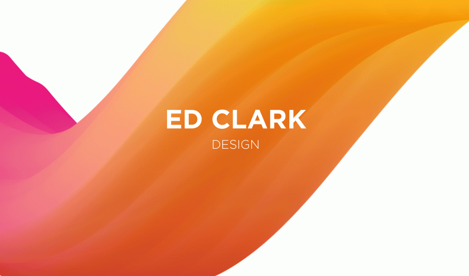
  • Tone of voice of the type – The designer’s name is a in a bold sans serif font, with rounded points giving it a more welcoming, playful, and less formal feel. The word design below the designers name is all in lower case, which contrasts well with the all caps of the designers name, though in the same typeface. The typeface used in the for the menus and information is a serif font. This helps the reader easily read along a line and increases the readability. The audience would expect to to find the informative text in this type of font.
  • Choice of typefaces – are they effective for screen use? – I think they do work well on screen. They are easily read and the two typefaces complement each other well. The designers name is clear and is aligned in the same place on every page.
  • Bulk or lack of type – is it too much, too blocky, too small etc. Say HOW/WHY it works or does not work – There isn’t huge amount of text on any page. I think the designer has done this on purpose, to draw attention to the images. These images visually communicate to the audience, and I think the minimalist design shows off the designers work in the best light.

Pentagram

What kind/type of website is it – Commercial/ Informative

Who is the website for, who is it directed at? Who might be using it – Other design professionals, brands.

Evaluate it in terms of its function and user group – what will they think of it? professionalism. On the opening page, there is next to no text, and the design companies work is displayed in even blocks on the page. Interestingly, there is a variety of work on display, from books from matisse, implying artistry, along with packaging, to screen based design and print.

Page size/length. Are these beneficial to the site or do they make it difficult? – The width of the page is dynamic, meaning if i shrunk the screen the images and text would format down rather than across, so I don’t have to scroll right and down. The banner displaying the name of the company and the navigation menus always stay win the same place, however are condensed to icons and a “P” which signifies the brand. When I scroll down, meaning the user doesn’t need to scroll up to navigate to a new screen.

How are images used? PMI but be specific about effectiveness and purpose – The images on the front show off the design companies work. There is a mixture of work, showing the audience that the company are not restricted to one medium of design, that they are diverse and have worked with large brands in the past. Interestingly, on the “Partners” page, the images of the designers are all in black and white. Black and white photography has connotations of formality and has a historic element. Also, the designers may have there own companies outside of Pentagram it unifies the designers under the Pentagram brand.

How is typography used? PMI being specific about:

  • Tone of voice of the type – The pentagram brand uses a modern, serif typeface, with strong contrast between thick and thin strokes. This gives the audience a feeling of modernist design. In comparison, the body text which is also a sans serif typeface gives the audience the feeling that the text is informative, but gives the feeling of modern and not old and historic like a serif typeface might. The difference in point size also distinguishes the informative text from the brand name
  • Choice of typefaces – are they effective for screen use? – I think the typeface choices work well on screen. The Pentagram logo is clear and give the right ideologies of the brand, feeling modern. The backlit display also sharpens the serifs and makes the design look clean and crisp. In conjunction with the sans serif body text, which also work well on screen with the same connotations of the logo.
  • Bulk or lack of type – is it too much, too blocky, too small etc. Say HOW/WHY it works or does not work  – There isn’t a massive amount of text, which the designer has done purposely so it doesn’t distract from the images of their previous work. The text that is implemented is in a small box. The typeface used looks contemporary, like helvetica which is widely accepted in the industry as the most popular typeface. The most popular information is highlighted in red, in keeping with the brands ethos. I think they’ve used the colour red to evoke the feeling of passion, that they love what they do and love innovating.

What kind/type of website is it – Commercial/ showcasing their work to potential clients

Who is the website for, who is it directed at? Who might be using it – Potential customers, Brands, Graphic Designers.

Evaluate it in terms of its function and user group – what will they think of it? – I think the audience will think the design is sloppy. Although the main image is clear, the menu is far too small meaning its difficult to read and navigate. The white text is also lost in parts when on top of a white part of the background image. Also, for a design company I don’t think it shows off their potential as well as it could.

Page size/length. Are these beneficial to the site or do they make it difficult? – the page is fluid, meaning when the window is resized the design scales to fit. This is good as the audience is never distracted from the main images.

How is typography used? PMI being specific about: 

Tone of voice of the type – The typeface used in the design is a serif typeface, that gives a modernist feel to the design. The point size gives the design a minimalist and uncluttered feel, which may be good for the ethos of the brand, however the readability of the small sized typeface on a busy background is reduced.

Choice of typefaces – are they effective for screen use? – I think the typefaces used could be effective on screen, however the way they are used as previously mentioned means the reader may lose information due to the choice of background and point size.

Bulk or lack of type – is it too much, too blocky, too small etc. Say HOW/WHY it works or does not work – The text on some links of the site are very wordy, on a white background. This is wasted space that could be used to further promote the work they have previously done.

Spin – www.spin.co.uk

What kind/type of website is it – Commercial/informative

Who is the website for, who is it directed at? Who might be using it – other design companies, graphic designers, brands.

Evaluate it in terms of its function and user group – what will they think of it? – I think the audience will get a good first impression of the design company. Everything is clear and well laid out. I like the fact that the images are big and centre aligned, moving down the page. The menu is also interactive, and moves out from the side pushing the images over. The use of black i believe is to show power and dominance in the industry, whilst still feeling contemporary. The black background against the white text works well too.

Page size/length. Are these beneficial to the site or do they make it difficult? – The images scale proportionally, meaning that the audience always has sight of the purpose of the site, to showcase their work.

How are images used? PMI but be specific about effectiveness and purpose – I like how the images are tiled down the page. They are also big and clear, which shows off their quality. However, these large images mean that less is displayed, meaning the audience must scroll down to view more. Maybe if the images where tiled, the audience would see more and their first impression when opening the site might be more positive.

How is typography used? PMI being specific about:

  • Tone of voice of the type – The typeface used is a long, thin sans serif typeface. The typeface has contemporary connotations, adding a smart sleek feel to the design.
  • Choice of typefaces – are they effective for screen use? – The typeface choices are clear on screen, and suit the companies ethos and market.

Digital Media -Pinterest

  • Explain why you think it is digital media – Pinterest is a way of sharing websites and images with other users. This is a form of social media, and can be shared on Facebook and twitter so the user doesn’t have to repeat themselves over multiple platforms.
  • How designer s and lay people might use or work with this media – This is useful for creative minds especially, as the user can collate a library of work that they find inspirational or interesting.
  • Something about the mechanics of the medium – People pin things to boards and categorize them. Then other users can fill in search criteria that leads them to the categories, where they can view other peoples pins and pin them to there own boards.
  • Explain what your interest in this medium is – I use pinterest a lot for research and inspirational purposes. Its easy to navigate and look for interesting design pieces, and just as easy to to store for a later date.

Pinterest_on_Android.pngPinterest_1.jpg

Digital Media – Digital Photography

  • Explain why you think it is digital media – Before digital photography, photographers used film which was wasteful, expensive, and a long drawn out process. As photography developed, it became apparent that there was growing demand for quick, instant access photography that was available to the masses. What digital photography lacks in anticipation and traditionalism, it undoubtably compensates for in efficiency. There are three main positives from digital photography: Quickness, Adaptability, and Post-production.
  • How designer s and lay people might use or work with this media – Most people have access to some sort of digital camera these days, whether it be a mobile phone, a compact camera, or a DSLR. Everyday people may used there smart phones to take snapshots. These pictures used to be lower in quality than those you would take on a compact or DSLR. However, as technology has advanced, the quality of the camera and images has risen significantly, to the point where they can rival images taken on professional camera equipment. The user of a smart phone would take images for the purpose of social media uploads, where the quality of the image would be less important than the image it self. Compact cameras and DSLR’s have a digital display, where the user can manipulate features such as the iso, aperture, and exposure. This is good for when the image is the main focus, and the quality should be better so the audience takes an interest in the image.
  • Something about the mechanics of the medium – As previously mentioned, the settings can be changed by the user to manipulate the final resulting image. The user can also compose the image using a digital LCD display, which is useful so the photographer doesn’t have to bend down and view it through a view finder. The resulting image can also be viewed on the LCD screen, meaning the user wouldn’t have to wait a long time for the film to develop in more traditional methods.Iphone_Camera.jpg
  • Explain what your interest in this medium is – As a graphic designer, I visually communicate with my intended audience everyday. The importance of quick, effective, and good quality photography is key in my job. The quality of the image must be the best possible, so the signifiers aren’t lost to the audience. I used my smartphone for my blog, as its quick and easily accessible. Also the image quality is less important for demonstration purposes on my blog. NIKON_D60_1.jpg

Asahi_Pentax_S3_with_film.jpg

Digital Media – Facebook

  • Explain why you think it is digital media – Facebook is a platform that allows users to share media online, anywhere in the world. The site gives the user the ability to raise there digital media profile, and broadcast there thoughts and feelings through status updates.
  • How designer s and lay people might use or work with this media – The user can communicate with there other friends using the service. They have the ability to share images, video, and messages with other users, increasing there social interaction without having to be face to face. The user can also create groups, for example if the user is part of a football team, the groups message board can advertise the game time, date, meeting time etc. Advertising companies have exploited this service to send targeted ads based on the trends of their search history. This has spread debate across the world about data security. Does the user know their information is being stored and sold to a third party? Facebook_Mobile.jpg

Many companies have used Facebook as a free way to advertise there business. A strong social media presence is incredibly valuable to a business as it opens up the barrier of communication and accessibility to the wider world. Reviews, comments and information can be shared on a businesses “wall”.

facebook_laptop_sml.jpg

The user also has the ability to share across multi platforms, so the same message doesn’t have to be repeated lots of times to the same audience.

Twitter_Share_Facebook.png

  • Something about the mechanics of the medium – The user initially sets up an account with Facebook, supplying them with personal information, and critically an email address and password that Facebook can communicate with the user. For example if there was a security breach, Facebook are able to email the user to their personal email address to resolve the problem. After the setup process, the user befriends all of the people they have associations with. After these people have accepted the friend request, the users are able to look at each others media online. Each post is displayed on “the newsfeed”, which is like a continuous feed of media to scroll through.
  • Explain what your interest in this medium is – Everyone these days has a Facebook account. I personally use Facebook to communicate with my friends and colleagues, as it is quick and accessible. As the site is online 24/7, there isn’t any need to save phone numbers, as the data has already been entered by the user in the setup stage of the account. The user can change or update these details at any time. I also used Facebook a lot when I traveled. It was an easy way to share experiences in the form of images and videos. I simply created albums and uploaded them onto the Facebook server. My friends were able to see the media and comment or “like” individual images, sparking debate amongst my group of friends.