Chelsea Flower Show

I had the opportunity to work with a clients proposal for product of the year at Chelsea Flower Show this year. This involved me taking studio product shots and envolved in the design process for the application. The Leda and the Swan design stems from a Greek Myth. Sleek curves and dynamic design tell the story and is perfect for any size garden, big or small. Chilstone have sold two already for charity, raising a few thousand so far. Coverage of the show will be broadcast nationwide, so hopefully it will be on tv screens soon!

http://www.chilstone.com/garden-ornaments-statues-and-sculptures/leda-and-the-swan/

http://www.telegraph.co.uk/gardening/chelsea-flower-show/chelsea-flower-show-2017product-year-competition/leda-swan/

https://www.hevercastle.co.uk/news/chilstone-create-leda-swan-sculpture-inspired-hever-castle-piece/


Statue_01IMG_4929_1IMG_4937IMG_5030IMG_5199

FMP – Type Choices

I tried a variety of different typefaces, thinking about the house style of my book. I wanted the design to seem clean and clear, whilst also being visually appealing. I tried something that I’ve previously been advised not to do, which was implementing a script font. From previous experience, using a script font reduces readability, however it does add a stylistic element to the overall design. I chose to look at script fonts mainly to add a personal touch to the design. However, after comparing them to the a sans serif I still feel like the title needs to be readable, and is more so using the bolder typeface.

I chose Gotham as the house font. The font comes with multiple variations of weight, which will allow me to add hierarchy and contrast between titles and texts. I like how it neutralises the design, which works well with the isolated white background and food imagery.

FOOD4THOUGHT_BOOK_01.jpg

Screenshot 2017-05-22 11.35.54Screenshot 2017-05-22 11.36.08

FMP – Setting Up A-Master & Baseline Grids Indesign

I re-capped on how to set up an A-Master page by watching an online tutorial. This will allow me to keep continuity on each page, whilst also working quickly and efficiently.

They also help the reader navigate, by displaying direction such as a menu bar, page number, or book title.

Screenshot 2017-05-20 10.21.17.png

I used a simple design, automating the page numbers as I progress into the book, whilst also adding a reminder of the book title placed in the center of each page. I created margins and columns to give structure to my pages, however, some pages may change, and I will adjust the layout and grid accordingly.

I also used a baseline grid, adjusting the grid to the leading value of my text, and then snapping the text to it.This will further enhance the structure of my design

Screenshot 2017-05-20 10.49.19


Screenshot 2017-05-20 10.46.16

I’ve learnt from previous experience it’s good to start with a good structure, as this gives the foundation in which to layout text and images effectively. I want the reader to feel engaged, whilst also feeling comfortable and enjoy reading the book.

FMP – G.F Smith Paper Choices/Research & Swatch Book

One of my design considerations was to choose the material on which to print my book onto. I’ve attended two lectures in the past couple of years from G.F. Smith, who provide interesting and quality papers to the design industry. They gave us samples of particular papers, demonstrating how they can be used to the best of their abilities. I looked back at these samples and reminded myself. I also examined the G.F. Smith swatch book, which allowed me to feel the paper in different weights, and explore a wide variety of options.

I refined my choices to two paper stocks:

  • Heaven 42 – A “blue” shade of white. Originally designed for a luxury car company, Heaven 42 was designed to lift metallic objects of the paper.
  • Strathmore – Almost like cartridge paper, I really liked how the feel can change dramatically from the choice of paper stock. In contrast to Heaven 42, the shade of the paper is slightly duller. This may mean my vibrant colours may be lost slightly in the darker paper, and the ink looks to seep into the paper more.

In conclusion, I think my book would benefit from a clean feel to it. From previous experience working with isolated food product images, I often add a blue tint to the white background to get a purer white. This lifts the vibrant colours of the fresh food from the background, as opposed to a yellow shade which would imply dirtiness.


20170508_113200


GIF Design

I created some business cards for the show, and to tie in with that, I also want to potentially have a display screen to add interest to my exhibition at the end of year show. I followed some tutorials on how to use timeline in photoshop, to create a flowing glowing effect, adjusting the hue of different layers and adding “tweens” to add motion. Although the image belowmay appear grainy, the screen should display the image seemlessly.Screenshot 2017-05-12 12.45.37.png

Untitled-4

Final Designs – Dungeness Postcards

After careful selection of my photography, I wanted to use simple but effect  way of identifying the area. I used a transparent box, with a scratched texture over the top to add interest. I also clipped the text to the background image, making it seem see-through, through the white transparent box.


Dungeness_postcard_printDungeness_postcard_print2

To conclude on the project, I actually found it really interesting to be submersed into a different environment, whilst being able to see and and experience new sites. This is invaluable as a graphic designer, as it gives me inspiration for future projects, and encourages me to experience more and implement them into my designs.

FMP – Disintegration Effect Photoshop

One effect I’ve always been fascinated with is disintegration of an isolated subject. My title for my book is “Food For Thought” and I feel this gives me scope to use my creativity on the front cover of the book. The idea I want to get across to my audience is thinking about the food we eat. I feel the disintegration effects signifies the digestion process of the food, whilst also being dynamic as a piece of art.

I selected an image of a strawberry, attempting to symbolise healthy eating.Screenshot 2017-05-08 15.41.57

I created a new layer, and made a selection around the whole strawberry, without the shadow. I saved the path but kept the selection, and cut the strawberry onto a new layer. I filled the selection with white. Using the paint brush tool I then painted everything other than the shadow pure white, then selected the image, copied it, and pasted it onto an alpha channel. I created a fresh new layer and loaded the selection, and finally filled it white black.

Screenshot 2017-05-08 15.42.20

I created a new layer with the cut strawberry, and used the used the liquify tool to stretch the colours out, giving me space to create the disintegration effect. I created a layer mask, filling it with black to hide it for the moment..

Screenshot 2017-05-08 15.42.46

On another cut strawberry layer, I started to use scatter brushes to “chop” into the strawberry, which will allow space for the effect to show.

Screenshot 2017-05-08 15.44.10

On the liquified layer, I used more scatter brushes to reveal more of the layer mask.Screenshot 2017-05-08 15.44.22

The Final Pieces..

Screenshot 2017-05-08 15.44.26.png

FOOD4THOUGHT_BOOK_01


Dungeness Bomb Project

We visited the RSPB in Dungeness, mainly to experience a different environment, but also to gather inspiration for not only this project, but future ones too. We were tasked with making a couple of postcards inspired by either illustrations of pictures we took in Dungeness. Whilst walking around, we were encouraged to keep noticing different species of birds, and also how quickly the mood and environment could change simply from the weather. There was an interesting contrast between the natural environment of the bird sanctuary, and the industrial power station site just across the water.

We also visited the lighthouse just up the road, which gave a really interesting and different perspective. Below are some of my best images, that I have edited in photoshop using the camera raw filter. I sorted through all my images, choosing images that had good composition, whilst also expressing the diverse nature of the landscape.

IMG_4859.jpg

IMG_4870IMG_4796

FMP Research – Typography & Layout Design – Food For Thought

I found some really eye catching layouts, but also some great tips on typefaces. All of the below cook books use a combination of two typefaces. One defines each title for the page, whilst also linking to the front page of the book. The other is used for the body text of the book, where variation in weight can distinguish between sections such as ingredients and method with contrast.


This layout below is simple, clean and very effective. I love the use of neutral white, as this gives a lifestyle feel to the book, whilst also providing contrast against the food. Lighting of the image is also very natural, shining from the left, casting shadows on the right.

recipe-book-design-32b

Interestingly, the image below has been shot using reflective white materials, which adds interest to the white bowls. The designer has considered the purpose and the target audience, providing a sleek feel to the design.

recipe-book-design-32a

I’ve previously mentions this technique of shooting from a 90 degree angle before, and its something that I am looking to implement in my student cook book design. The designer of the piece below has used a black background to add contrast to the vibrant oranges and yellows displayed. However, although I like the contrast between the black and white pages, I feel black has dark and negative connotations, and I want to maintain a neutral, vibrant feel.

recipe-book-design-24c

I chose to look at the design below because I found the material used to print the book interesting. They chose to print on rice paper, which ties in with the subject of the piece. Rice paper is also biodegradable, which has natural and healthy connotations. I also like how they’ve created layers by having an underlay of text with slightly reduced opacity. Although part of the words are hidden, the reader is still able to pick up on the sign without having to search very hard. The typeface used is a bold Sans Serif font, similar to Bebas Neue that I have used previously. I works well in conjunction with the Serif font used to define the body text.

recipe-book-design-23c

The colour scheme also works well, with two colours used to define text, red & white, and a signature colour of the brown, “eco-friendly” rice paper.

recipe-book-design-23b

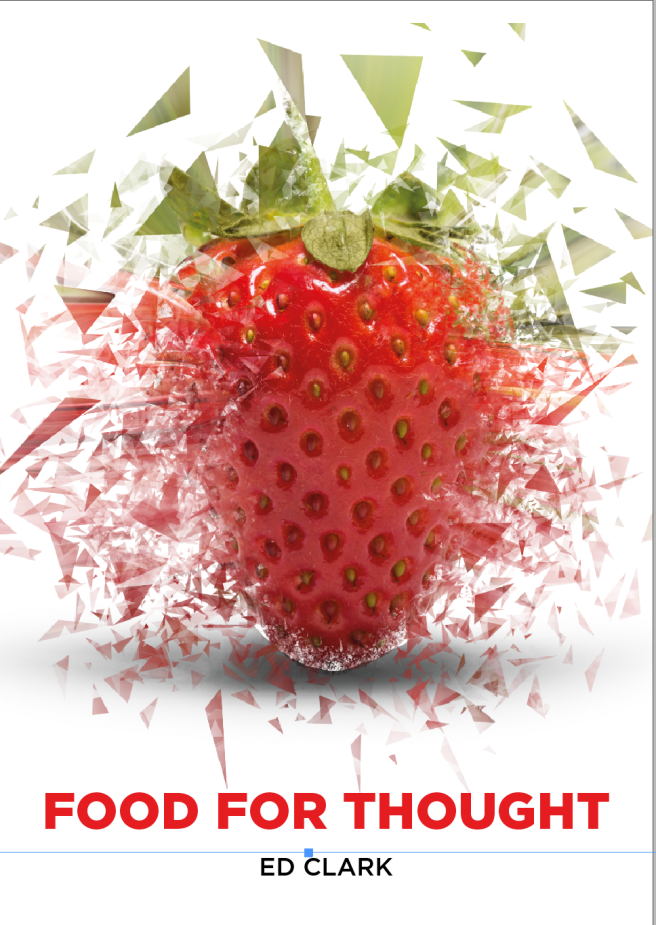
I love the layout of this design, and it’s a style I am very familiar with in previous projects. Using white backgrounds gives the opportunity for the natural vibrant colours to pop out of the page. This dynamic effect can only be achieved with the aid of shadow beneath the subject. Otherwise, a standard clipping path without the shadow in photoshop would make the subject flat and less effective.

recipe-book-design-8b

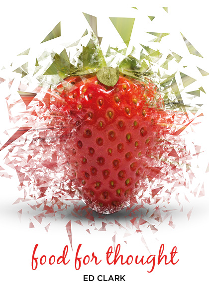
I’ve always been swayed away from using script fonts as they lose readability compared to a Sans Serif or a Serif font. However, I think in this instance, there is a lot of white space around the script typeface used on the front cover, which draws the readers eye after seeing the plate and smear of vibrant colour. It’s a design choice the designer has made in order to give a homely feel to the design, meaning the recipes can be achieved by anyone

recipe-book-design-8a

FMP – Scamping Pages – Food For Thought

After gathering research from other cook book layouts, I took to pencil and paper to visualise how I might layout my design in an appealing way to my audience. I intend to include infographics on my spreads, which may change the layout, but at this stage it’s interesting to just experiment and enjoy working out where elements may be presented to my target audience.

It’s also a vital stage in the planning of the photography, where I will need to select product in which to take to the photography studio to isolate. I also want to incorporate some lifestyle images too, showing off the recipe in it’s best light. My next stage is to make lists of all the products I want to shoot, and then think about angles and different shots/styles.

20170503_114010-120170503_114027