Final Design – Group Ethics Poster

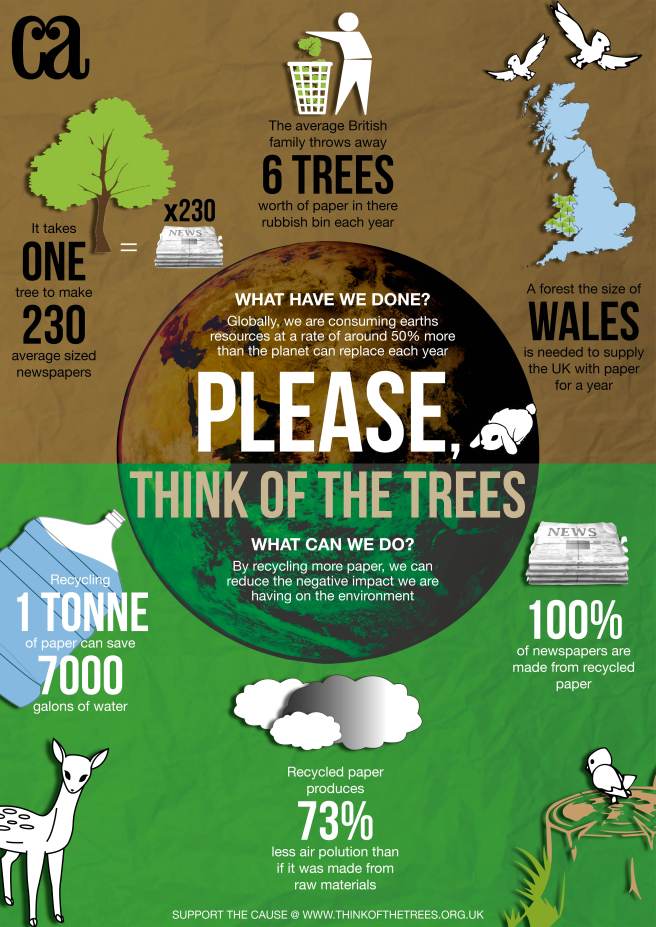
In this post I wish to show you our finished design for the group ethics poster project. Overall I felt we worked well as a team, and were able to bounce ideas off each other, with constructive criticism of each point. It helped that our own strengths as designers came out. I feel my strengths do lie in layout design and typography, were as the illustrative people in the group did a great job in visually communicating our points through the form of animals and other icons related to the environment and paper. The whole tone of the design is environmentally friendly, trying to get the audience to think about the issue.

Group Poster V2.jpg

Icons

After deciding on a topic within ethics, we found key facts within the paper industry that would be of interest to the reader, but also giving relevant information. We made a list of the most interesting facts and then looked at how we could visually portray the information in a way that was interesting, but gave the information without the reader actually reading the text. The icons should be bold and clear and aid the reader.

The list of interesting facts are as follows:

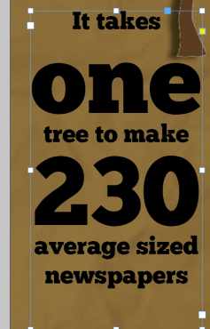
  • It takes one tree to make 230 average sized newspapers
  • The average British family throws away 6 trees worth of paper in there rubbish bin each year
  • A forest the size of Wales is needed to supply the UK with paper for a year
  • 100% of newspapers are made from recycled paper
  • Recycled paper produces 73% less air pollution than if it was made from raw materials
  • Recycling 1 tonne of paper can save 7000 gallons of water


Typeface Choices – Group Poster

After conducting my research into other infographics, we collaborated as a group to decide which typefaces we could use to make out message clear and give the right connotations. As previously mentioned in my research blog, the figures are usually big and bold, using a sans serif typeface. This makes it easy for the reader to locate the important information. With this in mind, we looked at the following typefaces and their connotations:

Bebas Neue – A bold sans serif typeface, popular amongst typographers, and has been referred to as “the helvetica of the free fonts”. Different weights give clean lines and easy contrast. Elegant shapes and straight to the point look combined with gentle warmth, makes it perfect for web and print.

Screen Shot 2016-04-19 at 19.24.32.png

Chunk Five – I looked at this font as when i researched the history of the typeface, it said it was reminiscent of old American Western woodcuts, broadsides, and newspaper headlines. This link to newspapers was interesting, however the UK audience may not understand the historical context of the typeface. Never the less, the ultra bold slab serif typeface looks great as a display font.

Screen Shot 2016-04-19 at 19.23.52.png

All Over Again – A hand-written like typeface with scribbles around the text. I thought the scribbles might link into the idea of paper, however the scribbles actually distract from the information, and doesn’t look right on the page.

Screen Shot 2016-04-19 at 19.21.06.png

We then looked at what typeface we would use for the lesser information. Bebas Neue is a simple but elegant typeface, so we wanted to match this with a light, balanced typeface. We looked at many different combinations:

Helvetica – designed to be “neutral” this sans serif Grotesque typeface balances well with the stylish, bold bebas. Most importantly, its easy for the reader to read, and therefore the understanding of the fact and design is increased.


The Final Designs

Over the period of a week, we sat down with all of our elements and chose a suitable layout for the design. The brief states that the poster should be folded, and of the size of A2. It was important to note that the poster should be folded, to make sure that when we were designing, no information was lost in the fold. This made us think about sections, and how we could display the information in the best possible fashion.

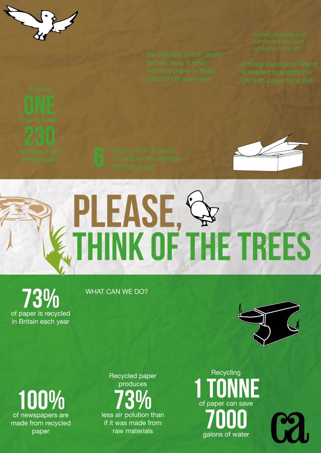
Our initial design split the page into two, with a banner in between with the title of the document. Although this design was practical, it seemed very boring and might not capture our audiences eye as much as we would like.

Group Poster.jpg

Our second design uses the world as the natural anchor for the facts to orbit around. We felt the spherical shape of the earth would help us to divide the page appropriately, whilst being able to horizontally fold the poster without any loss of vital information to the reader.

We used the combination of bebas neue and helvetica (variations of different weights)

Communication Arts Magazine

As the brief states that we are designing for communication arts magazine, I thought it was important to take a look at the style and ethos of the magazine and brand.

Communication Arts is the biggest international trade journal of visual communications. The magazine covers a broad spectrum of mediums, such as graphic design, advertising, photography, illustration, and interactive media.

I was strolling through the gallery on the Communication Arts Magazine, and found this article about packaging that I thought ties in well with our chosen subject of paper. Matt Ebbing designed a “carton” that would show off the special and unique product. The package is made from moulded paper pulp, similar to an egg-carton, that is in the shape of the nested shoes. It’s light, space-saving and made with 100%PCW pulp that is 100% compostable.

http://www.commarts.com/gallery


Shoe_Packaging_Ethics

Another design that caught my eye was this infographic illustrating what really lies beneath the sea. Its uses key signifiers such as the different shades of blue giving depth to the design, and contrasting white which leaps off the page and catches the audiences eye. The audience associates these colours with the ocean. The reader is guides through facts with a faint white dotted line leading them to the bottom. As the reader gets to the bottom, the shade of blue turns into a almost black, signifying depth of the sea. I think its important to note the amount of facts and figures used, and how they are highlighted and enlarged compared to the rest of the text. This draws the audience in to the exciting fact, and then leads them to further information about that fact.

I also like the typography used, not only in the large title at the top, but throughout the design. There is a clear style throught the design, with large text in a modern typeface with strong contrast between thick and thin strokes, and a sans serif typeface that looks similar to helvetica.

There are small little embellishments around the design, however the designer has used small elements effectively to get the right messages across to the audience.

 

Infographic_Communication_Arts_Magazine

Ethics Poster Introduction

We were given a brief to think ethically within graphic design. So what does that mean? Well to better understand, we were put into groups and given scenarios on pieces of paper. These included:

  • A charity has asked you to design a poster however can’t pay you, what do you do?
  • A client has asked you for an amendment to a design for free as a favour, but you normally charge, what do you do?
  • The agency you work for has asked you to work on a design that promotes natural fur.

This got us thinking about the real world, and debating in groups made us break each problem into pros and cons, and how we might react to the scenario.

The brief asks us to produce an infographic for Communication Arts Magazine about cultural issues and theories that impact on the creative industry. In our groups, we sat down together and made a mind map of all the different issues surrounding the graphic designers, and how we might represent these issues in a infographic.


We then chose a from the mind map our topic for the infographic. We chose paper and how it impacts the environment, making graphic designers aware of the impact they are having when they are putting “stuff” out in to the world.