In this blog post, I wish to demonstrate my process from start to finish using screenshots as a work.
I started by outlining the basic shape of Homer Simpson. A combination of using the pen tool, and the pathfinder pallet to merge and divide certain shapes to make the lines as clean as possible.


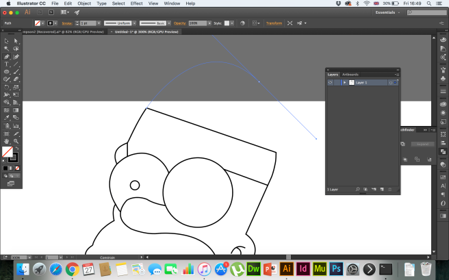
I adjusted the handles all around homer to make sure every element was smooth and realistic, without an imperfections.
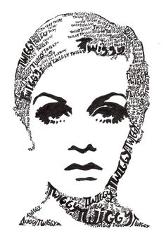
I then opened a separate document and laid out the typefaces I may or may not use in the design. From my initial planning and sketches, I was able to easily select suitable typefaces. I already had a lot of these in mind, however after looking through my type kit, I found Futura extra black, which I thought stood out and would be great for the body of my design. DK Petit four is my experiment.It’s 3D child like charm may be difficult to warp effectively, and the type may not be readable. Chunk Five is another display font, like Bebas and Futura extra black, however has strong serifs from being a slab serif font. This may contrast nicely with the other two quite neutral display typefaces. For Homer’s face, I wanted to use a combination of thin and shadowed type, as there are more intricate shapes making up Homer’s face. In contrast to his big bold body, I wanted his face to seem more complex, featuring his thought processes on a daily basis. “Bubble Gum” is the bubble font I pointed out I wanted to use earlier in my research for the “mmm doughnuts” on a circle path, forming his eyes. I feel this typeface really brings out the playful, childish behaviour and mindset of the character. The DK Vermillion typefaces makes me think of someone quite simple minded, maybe even dumb, and Homer certainly has those stupid moments in the show. 

I then started to write out the lines and converting them into a mesh, In which I could warp the typeface to the shape of Homer.


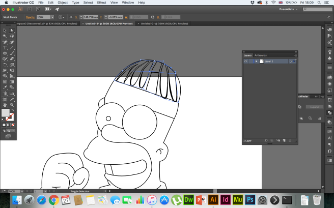


I found it quite difficult to get the proportions right when working in a confined and irregular shapes. However, I found using 2 columns and 2 rows in the mesh, I was able to stretch either sides anchor points out to the width of the shape, and then find the middle point. This made the words proportionate but with the necessary warp to get the shape. There was no loss of readability which was key.
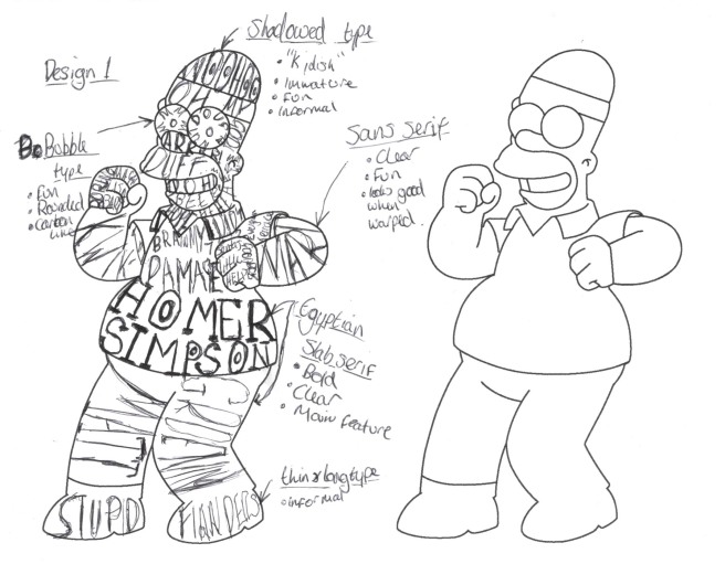
I carried on going through each part of homers body from top to toe, using my sketch as a guide. I changed the design slightly from my original sketch. I felt like there should be a prominent quote from home in the centre that makes the design have a purpose. The rest of the text would just be the catchphrases and characters associated with the character. The end result was as follows:

I was quite happy with the outcome. I started to think about my design and what background I might use to entice my audience. I produced some thumbnail sketches to show my ideas on paper. This will also help determine whether I should colour the design, or just leave it in black.
I decided that the design would have more interest if it was coloured. I then went online and googled to see if I could find the exact colours used to make up homers appearance. I found this website really useful, and I was able to match the RGB colours in my swatches palette in illustrator.


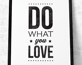
 Although i think it has the right connotations that Simpsons lovers would love, I think it distracts from the typeface and makes it harder for the type to really speak to the audience. For that reason, I chose to keep it on a white background, with my name featuring at the bottom right of the page. This simplicity lets the character and typefaces really stand out, and you can just imagine it hanging on the wall.