Below is a link to my final promotional video, animated in After Effects.
https://www.dropbox.com/s/kq8407hs4s2bdwj/Screen%2001%20MAIN%20COMP.mp4?dl=0
Below is a link to my final promotional video, animated in After Effects.
https://www.dropbox.com/s/kq8407hs4s2bdwj/Screen%2001%20MAIN%20COMP.mp4?dl=0
Below is a link to the final prototype, designed in Sketchapp, and made in Invision.
https://invis.io/ATJWII7C6Z2#/300379748_Comp-1
Reflections
My final major project has really developed my skills as a designer, opening new opportunities to learn new software skills to push my designs even further. My ability to use After Effects to animate screens has opened new opportunities for me, and look forward to new projects I can use these skills in.
After producing some some sketches to get ideas down quickly on paper, I moved onto the digital mockup of some of the logos. I experimented with a variety of different typefaces, looking for an American feel. This lead me to look at think slab serifs and bold san serif fonts, as I thought that might tie in with the varsity feel.
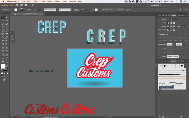
I didn’t want to put too much emphasis on the production of the logo, as this isn’t a branding project per se. However, I did want to show on my new found hand rendered skills. To do this, I replicated a typeface I liked online, experimenting with different embellishments. This personalised style fits in well with the customised shoes theme, giving a unique feel to the logo. The name started as Creps Customs, but after careful consideration, I changed the name to Custom Kicks. The name clearly explains the purpose of the brand in a concise way, making it easier to produce a logo.
Although I like the style and the appearance of the design, I felt the pairing of the typefaces wasn’t quite right, and this reflection also made me consider the name to. At this point, I looked at other styles of typeface that I thought might work. I did however, want to continue using the “Custom” lettering, as I think this would work well with a different style of typeface.

The above artboard demonstrates the creative process I went through, experimenting with different combinations of typefaces and compositions. adding brush strokes and playing with masks.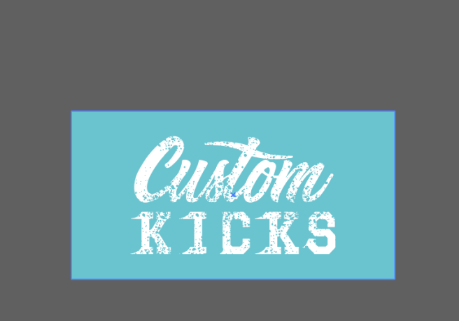
After a lot of thought and experimentation, I felt my best design was the following:

The personalised, fluid hand lettering in conjunction with the contrasting blocky slab serif typeface gives a nice balance to the logo, that would work well across a variety of applications, such as web, print, and mobile designs.
After finishing the final design for Social Enterprise Kent, the client invited my to their next B2B event in Canterbury, Grow Kent. This was a good opportunity to see the scaled version of my design. I’d just been looking at it on my small backlit laptop screen, so it was a good experience to actually see the final product, and understand the importance of a strong brand presence at such a large event such a Grow Kent.
Below is the final design.
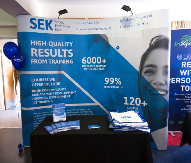
It was a great experience working with Social Enterprise Kent, and I wish them all the success for the future.
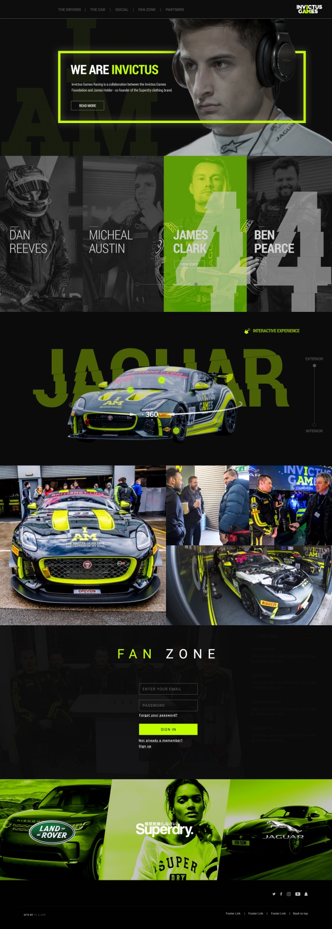
I created the site with fullpage.js in mind, something that i’d been shown at work and have identified in other sites. I think it could be a good way to compartmentalise each section and create a hierarchy of information. I wanted the user to have the flexibility of scrolling, or choosing the specific section from the sticky navigation at the top of the page.
The user is first met by an aspirational image of a driver, with a small amount of text introducing the brand and what they are all about. There is a small call to action below the text inviting the user to read more about the story. They’re also able to click the logo to reveal the about drop down.
I felt it was important to tell the stories of each driver, but I wanted the user to be able to choose which driver they want to scrutinise and find out more information. Invictus has two teams, so I wanted to distinguish them by adding a slider to toggle between the two teams drivers. As you can see, the number of the team has a distorted effect added to it. This was a design choice to encourage the notion of speed, inspired from the Nike Logo story, and the British GT program I found.
The car has been heavily modified to suit the needs of the rehabilitated drivers, which creates a USP for the brand. This is another thing that separates the Invictus brand from the rest of the teams in the GT Championships. I want the user to be fully immersed in the car, giving them up close and personal experience of the car, highlighting key aspects using buttons that reveal overlays that gives specific detail and more information. The user is again able to toggle between the interior and exterior of the car. Inside the car i’m proposing having a a VR experience, where the user is able to tour the inside of the car with their VR headset, again fully immersing them in the car.
Invictus Racing will be competing all over the country, and be in the public eye a lot. The brand has quite a big social presence, and this could be a good way of generating new content to the site. I designed some overlays to anchor the brand further, again using the “cut” design feature that runs consistently throughout the design.
I wanted to give the fans of the team and sport exclusive access to content that regular users don’t have. The user is asked to signup or register for full access to exclusive content, which is a great data capture tool for the brand, where they could use this information to target users with promotional material.
Finally, sponsors inject a lot of money into the team, and they want to make sure they have a presence of the site, as they are partnered with the brand. I wanted this section to appear tasteful, sophisticated, but continuing with the brands ethos.
Conclusion
I feel like i’ve learnt a lot this week. Even though in theory we had a week to complete the project, I have other work commitments during the week, so really I only had 3 days to complete the project in its entirety. I was aware of this tight deadline and tried to work efficiently in photoshop from the start, structuring the PSD in a professional manner. I did this so if it was a live project, and another designer needed to work on my PSD, they may be confused if they layers aren’t structured in folders. It also makes my workflow much faster. When you compare this project to the piece I created last year, World of Tanks, the difference is staggering. My eye has been trained to see finer details such a spacing, line height, and the impact of the imagery i’m using. I have made mistakes throughout the design process, but i’ve been able to take a step back and identify them quickly and rectify them. Overall, i’m happy with my final outcome, but i’m most proud of the way I presented. I’ve worked hard with colleagues at work about being confident in my own ability and what I design. If I don’t buy into what i’ve created, then how is the client? I was able to talk with conviction and confidence about my design, not putting myself down, and presenting my ideas in an enthusiastic and energetic way.
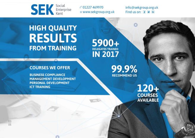
Below is a link to the final PDF I created for the SEK exhibition banner.


Conclusion
On the whole, I’ve found this project quite interesting. It’s allowed me to apply my print design skills in a corporate context, something that I’m familiar with from previous industry experience. Although there are very few text elements, this was a conscious design decision to not try and crowd the display too much. Less is certainly more in this project. I simply extracted the key information and presented it in an aesthetically pleasing, corporate manner.
I’ve recently been working on my presentation skills, trying to sell an idea or concept to a client. In the previous project, we looked at loads of different ways to be creative when presenting, and I wanted to continue to develop this skill in this project.
My plan was to create a small PDF outlining my process, starting with a mood board of everything I had looked at to gather design inspiration from. This gives the client an idea of the path I took to get to my end resolution.
I also wanted to show how the display would look like in real world context. I took to the internet to find some appropriate scenarios that could help me. I wanted to visually demonstrate how the banner would work at the exhibition, showing a silhouette of characters standing in front of the display, and a small table that would be positioned in front of the banner.
Below are the completed mockups to present to the client:


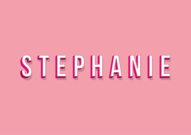
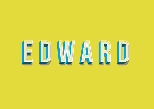
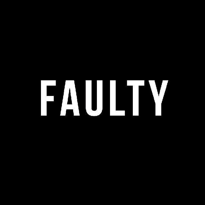
A few nights a week, I’ve been trying to find time to look at youtube to teach me something new, whether it be photoshop, illustrator, or after effects. Since starting a new design job, I feel I’m lacking in technical ability and need to strengthen my understanding of tools in all programs to move my work on to the next level, with more attention to detail.
Below are a few examples of my work:


Below are the final pieces I created.


![]()

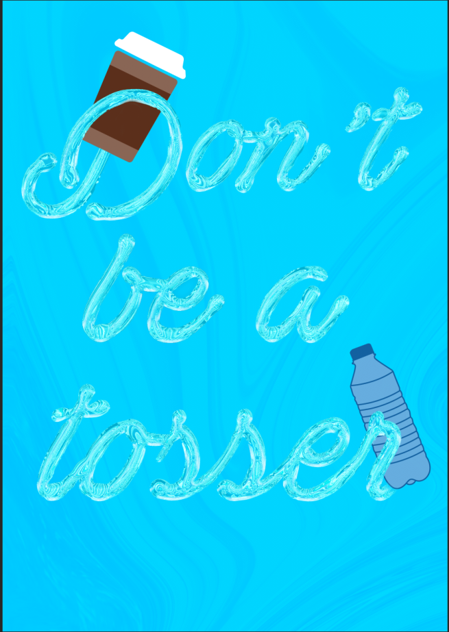
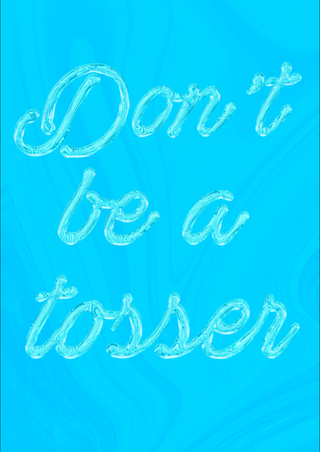
For our display, we wanted to created a banner and a graphic for the front page of the leaflet we intended to produce, which was light hearted and enticed the intended audience in. To do this, I felt a script font would be an appropriate choice of typeface as its informal tone lent itself well to the intended outcome. I wanted to convey the idea of fluidity, tying in with our theme, the ocean.
I started by descreasing the leading, the spacing between the characters, to give a fluid feel to the typeface.
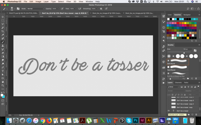
I then added a lighting effect to give directional light and shadows to the typeface. This would add a three dimensional feel to the typography, and a sense of realism. 
I then started to think about the effect. I added a chrome style to the typeface, using a preset in the filter gallery. This was the beggining of the “fluid” style.

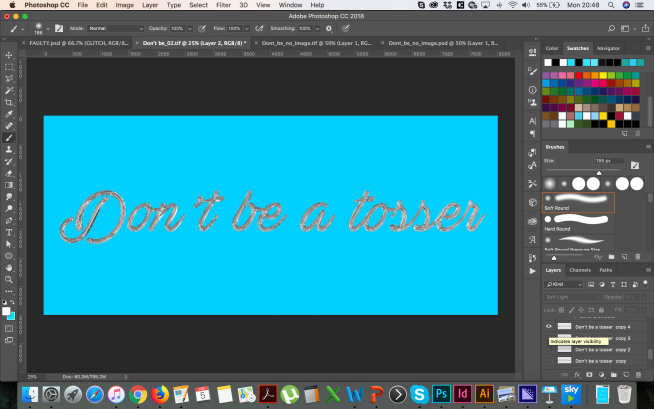
I then added further shadow to the back of the typeface to give more realism and dimension.

I then warped the text using a liquify filter to bulge the type were I felt appropriate, focusing the bulging on the bottom elements of the characters, and also where the characters joined. The end result, I felt, was quite effective.

I then used the liquify filter again, using an image with multiple tones of blue, and warping the text to give a spiral effect. I added this with a soft light blending mode behind the text to further anchor the idea of the ocean.