
We were given the task of thinking about the most effective way to present ideas to our fellow class mates, thinking about how they might engage with the case study and learn the information the best possible way.
I myself, opted to use a simple approach, using a poster and short concise bullet points to illustrate the case study. Using feedback from the previous presentation, and my own previous learning experiences, I find it easiest to learn through large visuals and little text, so the user isn’t overwhelmed and bombarded with vast amounts of information. I wanted to distill the point of the case study to its purest form, using typography and large, strong visuals to engage my target audience.
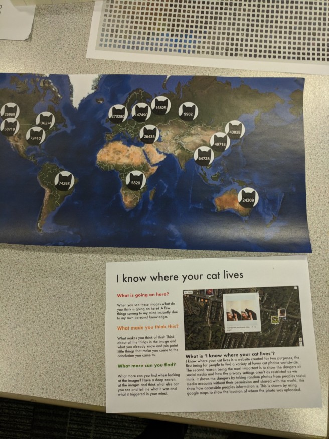
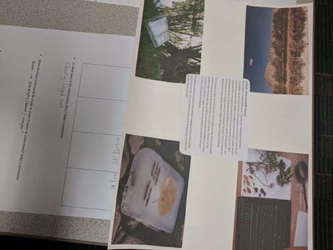
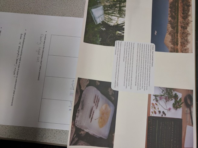
Below is my screen I produced for the presentation:

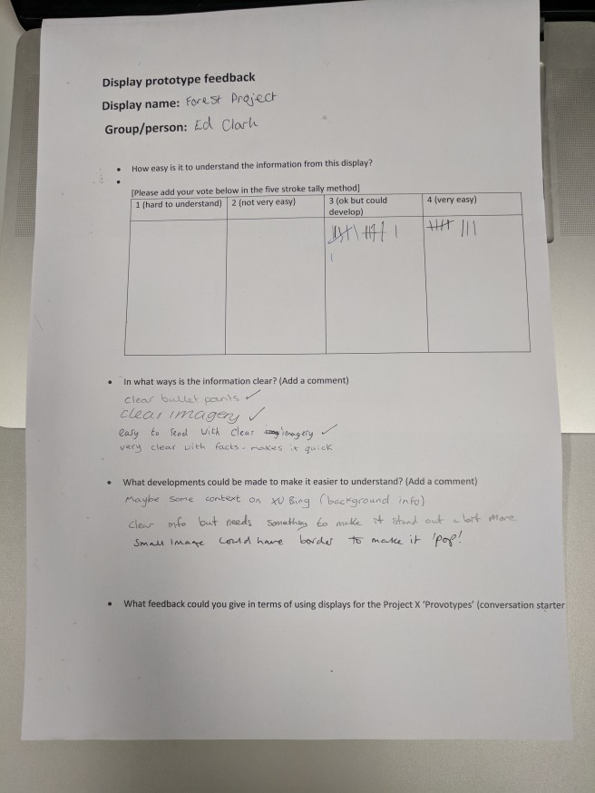
I gained some valuable feedback on my presentation. Although some felt the information was clear and easy to follow and understand, many felt it was ok but could develop further. My classmates felt the imagery was clear, however, there could be some more background information on the artist to give context to the design, which was an oversight on my part as I’d done a vast amount of research but just chose the relevant information to put into the display.
After viewing other people ideas to display information, it made me think about the relationship between this exercise and Project X. We are going to be speaking to people through visual communication to stimulate debate and spark conversation on our given topic, which they will no next to nothing about. Its imperative that we engage them and make it “fun” in order for them to learn the information we want to get across and, hopefully, make a change for the better. Some of the best displays exploited a variety of different human senses I noticed, such as smell, touch & sound, not just what they could see. This left a memorable experience for the user, in which they can recall at a later date.

Takeaway
My main takeaway from this session was to think about different human senses when displaying information, and using gamification to encourage a positive reaction from the target audience. This is something I wish to strengthen as the project progresses.
