I created the site with fullpage.js in mind, something that i’d been shown at work and have identified in other sites. I think it could be a good way to compartmentalise each section and create a hierarchy of information. I wanted the user to have the flexibility of scrolling, or choosing the specific section from the sticky navigation at the top of the page.
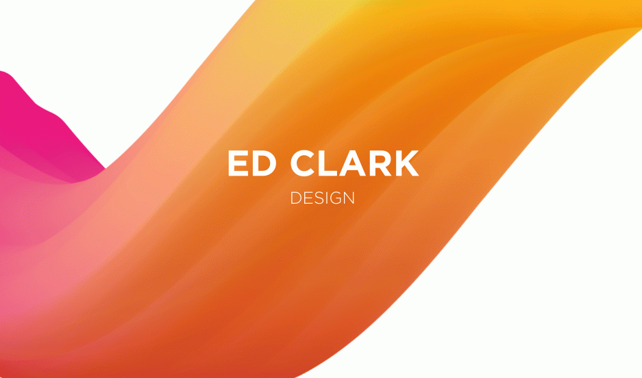
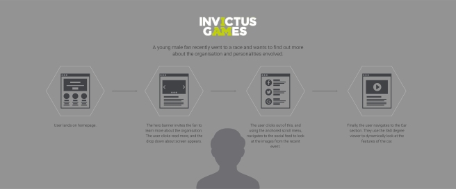
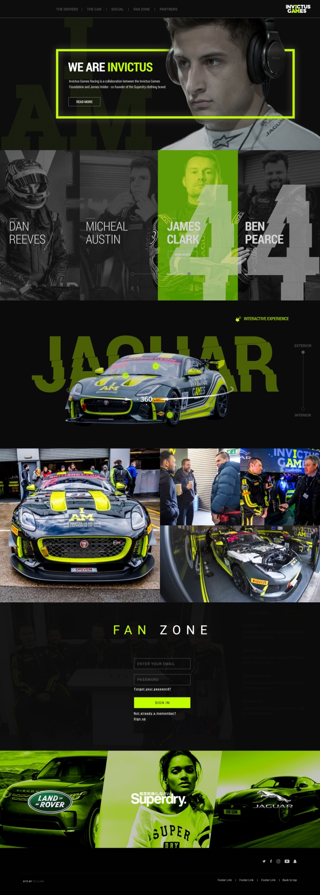
The user is first met by an aspirational image of a driver, with a small amount of text introducing the brand and what they are all about. There is a small call to action below the text inviting the user to read more about the story. They’re also able to click the logo to reveal the about drop down.
I felt it was important to tell the stories of each driver, but I wanted the user to be able to choose which driver they want to scrutinise and find out more information. Invictus has two teams, so I wanted to distinguish them by adding a slider to toggle between the two teams drivers. As you can see, the number of the team has a distorted effect added to it. This was a design choice to encourage the notion of speed, inspired from the Nike Logo story, and the British GT program I found.
The car has been heavily modified to suit the needs of the rehabilitated drivers, which creates a USP for the brand. This is another thing that separates the Invictus brand from the rest of the teams in the GT Championships. I want the user to be fully immersed in the car, giving them up close and personal experience of the car, highlighting key aspects using buttons that reveal overlays that gives specific detail and more information. The user is again able to toggle between the interior and exterior of the car. Inside the car i’m proposing having a a VR experience, where the user is able to tour the inside of the car with their VR headset, again fully immersing them in the car.
Invictus Racing will be competing all over the country, and be in the public eye a lot. The brand has quite a big social presence, and this could be a good way of generating new content to the site. I designed some overlays to anchor the brand further, again using the “cut” design feature that runs consistently throughout the design.
I wanted to give the fans of the team and sport exclusive access to content that regular users don’t have. The user is asked to signup or register for full access to exclusive content, which is a great data capture tool for the brand, where they could use this information to target users with promotional material.
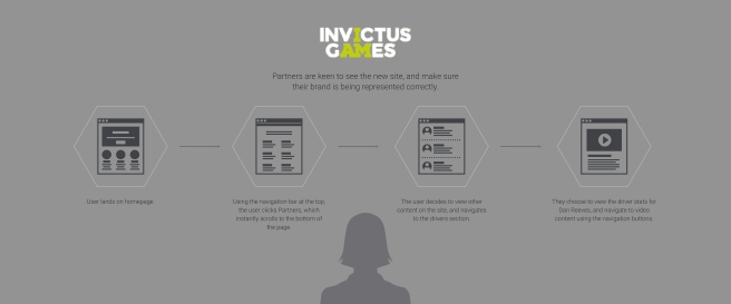
Finally, sponsors inject a lot of money into the team, and they want to make sure they have a presence of the site, as they are partnered with the brand. I wanted this section to appear tasteful, sophisticated, but continuing with the brands ethos.
Conclusion
I feel like i’ve learnt a lot this week. Even though in theory we had a week to complete the project, I have other work commitments during the week, so really I only had 3 days to complete the project in its entirety. I was aware of this tight deadline and tried to work efficiently in photoshop from the start, structuring the PSD in a professional manner. I did this so if it was a live project, and another designer needed to work on my PSD, they may be confused if they layers aren’t structured in folders. It also makes my workflow much faster. When you compare this project to the piece I created last year, World of Tanks, the difference is staggering. My eye has been trained to see finer details such a spacing, line height, and the impact of the imagery i’m using. I have made mistakes throughout the design process, but i’ve been able to take a step back and identify them quickly and rectify them. Overall, i’m happy with my final outcome, but i’m most proud of the way I presented. I’ve worked hard with colleagues at work about being confident in my own ability and what I design. If I don’t buy into what i’ve created, then how is the client? I was able to talk with conviction and confidence about my design, not putting myself down, and presenting my ideas in an enthusiastic and energetic way.